Posts in Brand Collaborations
Etsy UK and Ireland Design Awards 2016

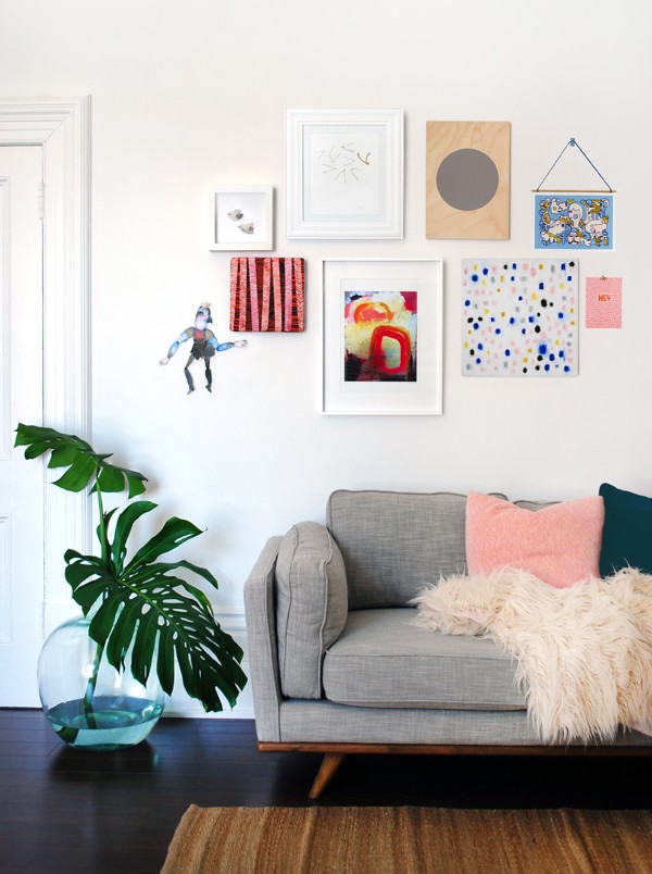
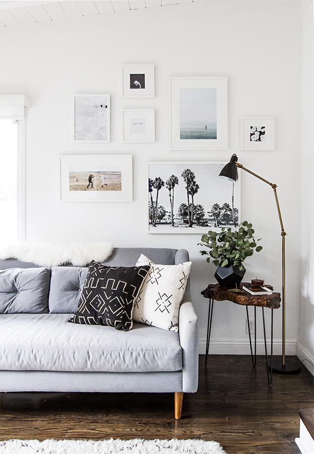
One of my to dos on a very long list of to dos is a gallery wall behind my favourite sideboard in our lounge. I look longingly at the beautiful photos on Pinterest but have always felt (which is going to sound ridiculous) a little intimidated of committing to such a big design statement. 

We talk about how we all go through a real cycle with artwork in our home. You start with posters and prints as a teenager, adorn your walls with fantasy crushes and people you'll probably never meet then as you get older, perhaps get married you fill your home with photos of you. We had photos of us in every room, our wedding, holidays, even the downstairs cloakroom had a montage of beach photos... again of us. And then the boys came along and they dominated our artwork. 

But then as we hit our mid thirties we became more confident in our interiors style and the family photos became smaller, in simpler frames along the mantlepiece and window frames and more original pieces and prints from our travels started to populate our walls. It's funny how it goes almost full circle, as you get older you might invest in pieces of art from a gallery, feel terribly grown up when you take something to be framed at the local print shop, with a little old man behind the counter whose perfected the art of bespoke framing over the last 40 years, and then as you get much older your walls become crowded with photos of family again, grandchildren, school photos given as gifts for Christmas and birthdays.

I have in mind to flood the stairway with black and white photos after my sister started a beautiful photo gallery up their stairs but for our lounge I think I'll keep the photos to the window ledges. 

zinneckergallerywall-112.jpg

Image credits: 1 Urban Outfitters 2 HGTV Emily Henderson3 We are Scout

I think the artwork you choose depends on the room itself. What you use it for, who uses it the most and what feeling you want the artwork to evoke. I guess you'd call our lounge a traditional sitting room. It feels like a more formal space than the family living area in the open plan living and dining room across the hallway. When we moved in we lifted the old carpets and found the original herringbone wood floor that is begging to be professionally sanded and polished. All in good time my lovely floor, once the new radiators are in I'll be right on you! And I love the idea of an eclectic mix of prints to balance the traditional heavy wood flooring and the dark wood beams across the ceiling and the inglenook fireplace. Fortunately the internet is bursting with inspiration! I LOVE hanging frames to break up the straight lines and give a wall a more playful feel and I also love bigger prints displayed together.

Fill the space you have!

Little prints can look so lost on a big wall, so I always look to use larger glass frames and mounts to give relatively inexpensive prints a more luxurious feel. It's like triangular cut sandwiches, I can't put my finger on quite why they taste nicer but they do. And the same goes for mounting your artwork. It makes it appear more expensive, more deserving of room to breathe before you envelope it with a frame. 

Image credit: 1 Stories / 2 Line Klein 

So the question is do you go for matching frames a la Sarah Sherman Samuel and My Domaine? Do you mix and match but in the same colour? I don't know why I've found it all so overwhelming but when you are talking about 5,6 maybe 7 or more pieces of art it adds up?

Part of me loves the idea of a very military style wall, prints from the same series all uniform in size and shape and framed in an identical fashion but then the other part of me adores the idea of highlighting the different types of media I love, photographic prints alongside watercolours and illustrations. 

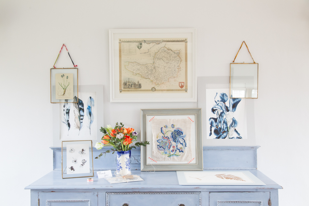
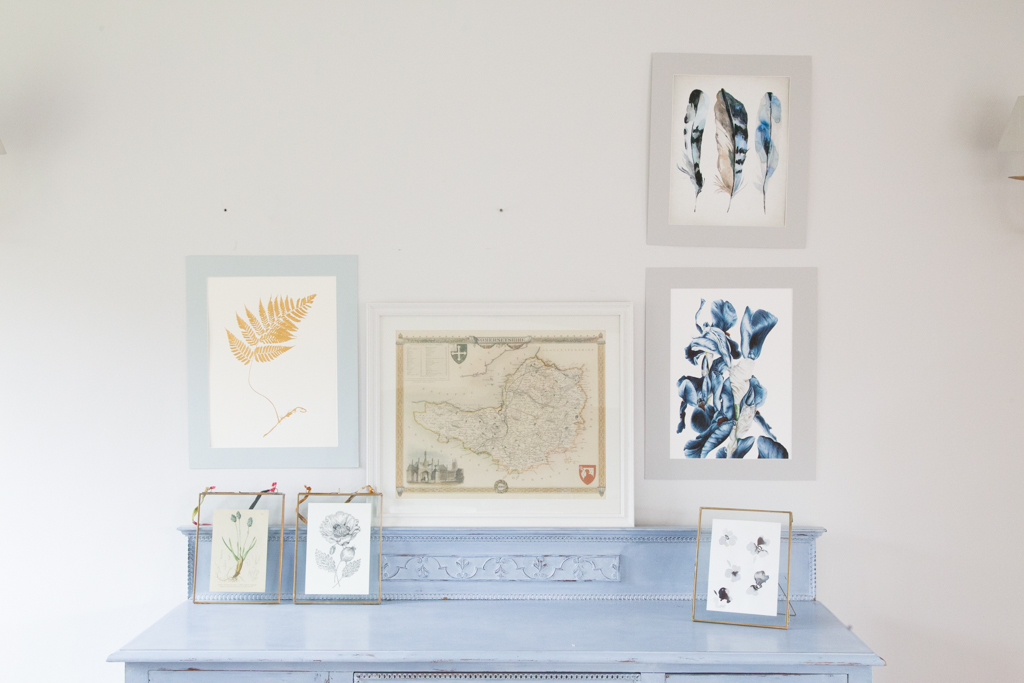
Whilst I am not necessarily a fan of complete unity in the frames or layout, I do love the idea of a theme to a gallery wall. To have a general subject matter that ties each print together. I knew I wanted a botanical theme to this part of the room and although we have some other more contemporary artwork as well as family photos on the other walls, I imagined this side of the room to be much more curious. 

But curious collections generally take time to put together. And I am not that patient! My absolute one stop shop for artwork is Etsy. For years I've browsed through pages and pages and seen more and more freelance artists pop up with their own Etsy shops. I love to decorate with blue which I find quite hard to find. There's scores of cushions and throws but prints and affordable art is much more limited. Correct me if I'm wrong!

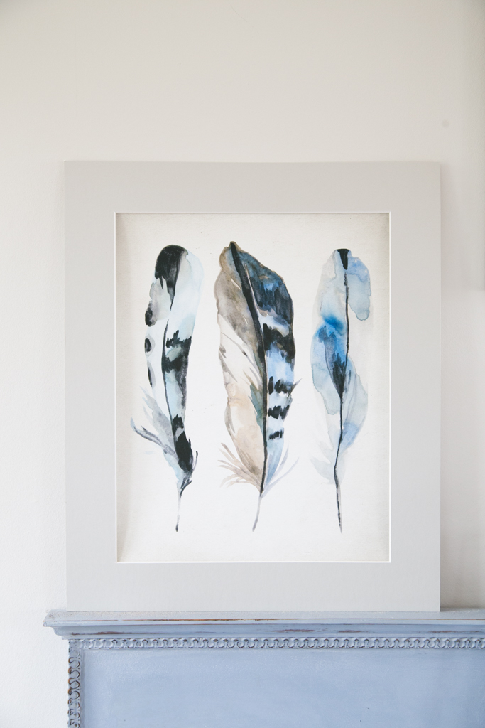
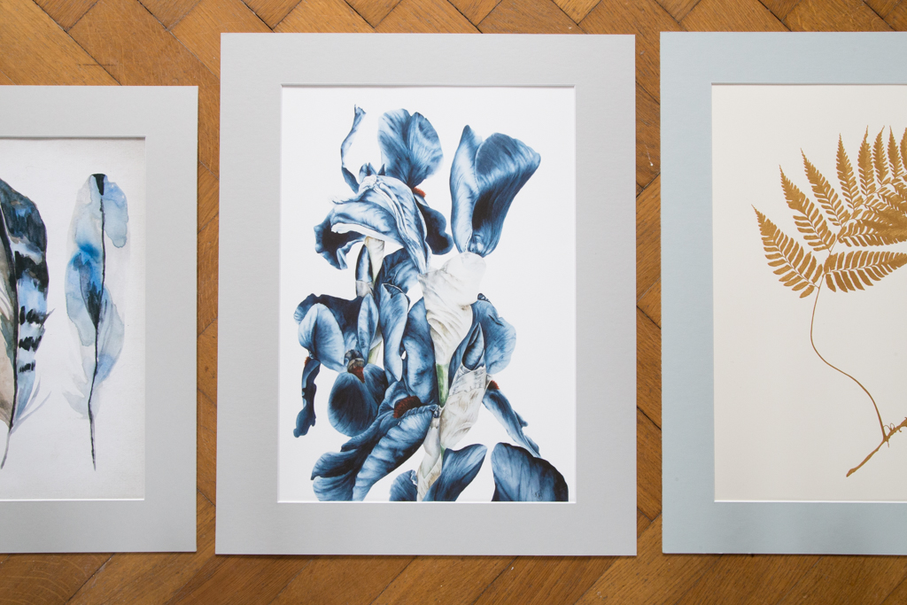
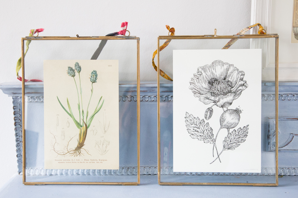
Within 5 minutes on Etsy I had found the most beautiful prints. A large vivid Iris print from BlueShedStudio, a hand drawn opium poppy illustration from Victoria Clare Gray and a beautiful blue feathers watercolour print for £7 from Quantum Prints.

IMG_3764.jpg

The big difference with buying from Etsy sellers is the extra attention to detail. The handwritten notes of thanks, the little cards with a simple message, tied up with string or sealed with patterned tape. And don't you think that the mountboard makes such a difference? I went to my local printing/camera shop who offers a framing service and they cut the boards while I waited for between £5 and £7. Now I have two prints that fit standard 16 by 20 inch frames that I can buy from most high street home interiors shops.

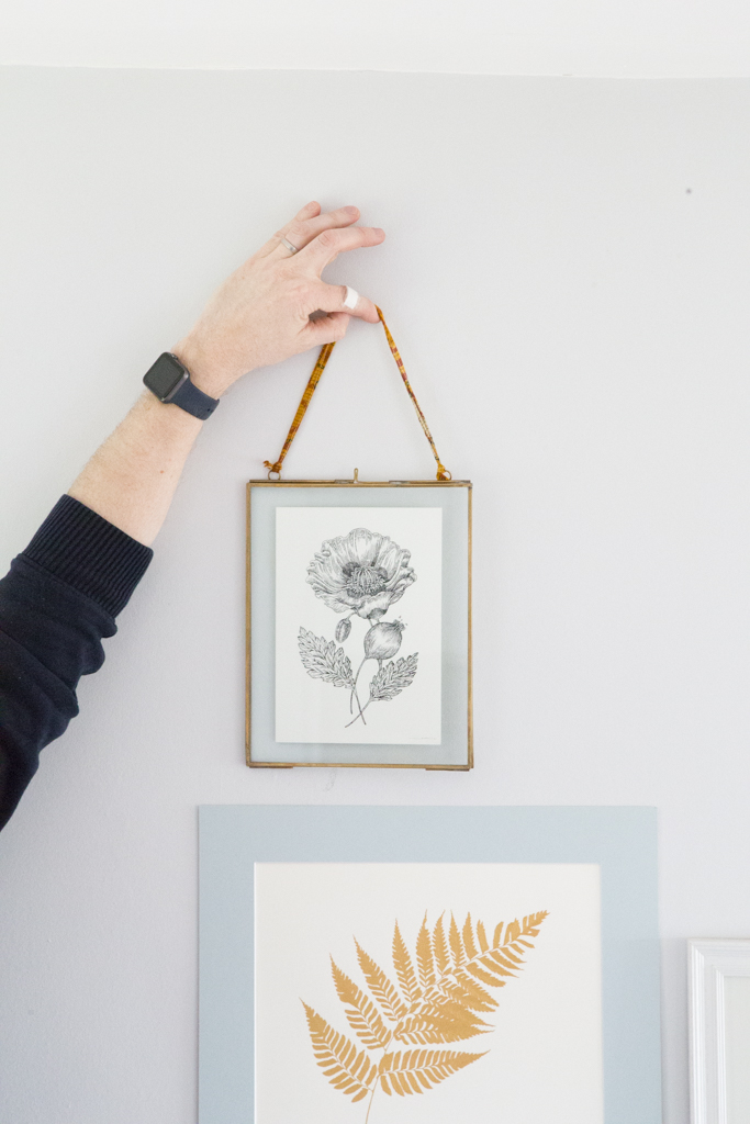
There are lots of ways to design your gallery wall, Taping paper the size of your prints to the wall, masking it out with washi tape or laying it all out on the floor, and I kept moving mine around, using bluetack to trial different positions to see which complimented each other more naturally.

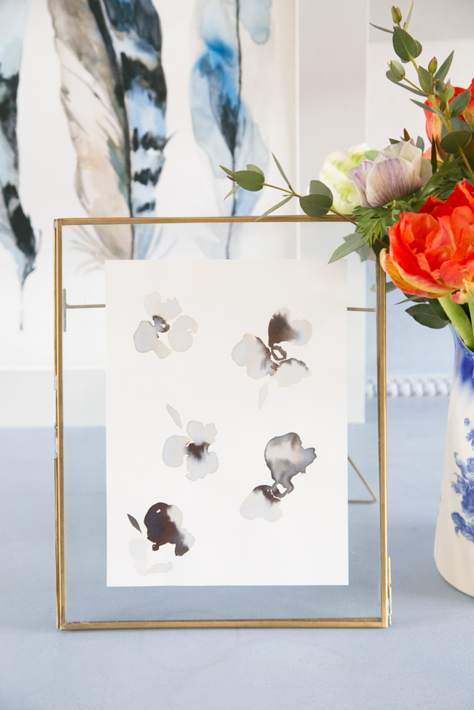
I've taken the original gold painting by Silke Spingies to be framed professionally and I can't wait to show you my final finished layout. The abstract watercolour print by Eddie and the Giant Peach looks beautiful in the standing frame so I might save that for the sideboard itself next to my favourite jug which I use as a vase for fresh flowers. 

For the first time ever they are inviting sellers to enter the UK and Ireland Etsy Awards!

I love that Etsy are so passionate about their sellers, that they want to shout from the rooftops about the designer maker community and highlight the talent in the UK and Ireland with incredible prizes and a chance to showcase their work at Tent London during the prestigious London Design Festival, retail opportunities with John Lewis and expert business training from The Design Trust.

So if you make something lovely and you fit into one of these categories what are you waiting for?! There are some amazing prices up for grabs including a £10,000 grant for the overall winner! 

  • Home & living.
  • Kids & baby.
  • Fashion & accessories.
  • Etsy New Talent, in partnership with The Design Trust.
  • Retail Star, in partnership with John Lewis.
  • People’s Choice, selected by public vote.
  • Regional awards, the best maker in England, Scotland, Wales, Northern Ireland and Republic of Ireland.

You do need an Etsy shop to enter the Awards but it's easy to apply. You can find full details on the Etsy blog. Applications close at midnight on 28th April 2016. 

Is this you?! What are you waiting for?!

And check back in to see my finished gallery wall :)

The Ideal Home Show 2016

I have a long list of exhibitions, museums and conferences I would like to go to. I've never stepped foot in the V&A, I have a secret jar of pennies to grow to one day head stateside to the Alt Summit and in all the years since we moved to our first house and started developing our own interior style, I've never experienced the Ideal Home Show.

My mum talked about her visit years and years ago, before you could plan your kitchen online or super imposed your new bathroom furniture onto a photo. I suddenly thought about how much we take for granted having the yellow pages in photographic form at our fingertips. I lie in bed at night researching lights from America that I could have delivered to my brother's house and mum could kindly bring back in her suitcase because I can't find anything similar here, we hop onto a store's free wifi and check out a competitor's price for a bookcase or armchair without giving it a second's thought.

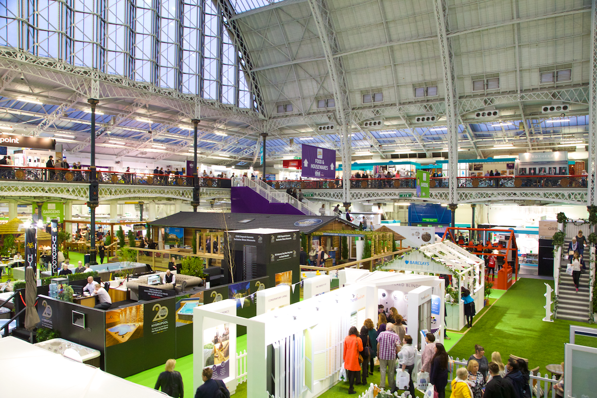
But the Ideal Home Show was all of that wrapped up under one huge glass roof and can you believe in it's 108th year! That's over a century of home inspiration for the nation.

When I say huge I mean ginormous. The kind of big Julia Roberts talked about in Pretty Woman. You walk in and the scale of the show blows you away.

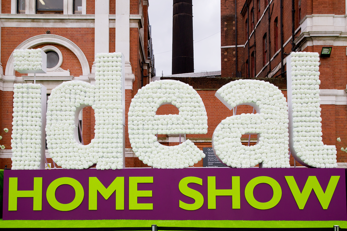
So I jumped at the chance to represent Roost and see the 12ft high floral letters, purple and lime green life size hydrangea trees nestled in a purple carpet for myself. Absolutely beautiful and completely monstrous at the same time! The signage at the entrance is just a hint of what's to come inside and the traditionally dressed doormen in their red coats and top hats gave me a wry smile as I waited patiently to snap a photo of the giant floral stuffed letters without passers by obscuring the view!

There's everything you could imagine that has anything to do with your home all under one roof. Complete kitchen stands, shower displays with running water and three houses. Not mock houses, real scale buildings. 3 of them, that create this central masterpiece and the must visit exhibition in the whole show. They look like dolls' houses when you are walking around the gallery mezzanine. The people walking in and out look like they have just stepped out of the Truman Show, the perfectly green artificial grass blanketing the walkways and queuing areas. 

They are quite simply a triumph of vision, master planning, modern technology and sheer hard work. These babies get put up and down in a matter of days, all for the viewing pleasure of the general public. It's a feat of engineering and hard graft.

As the Traditional Home sponsor Thomas Sanderson was taking me for a tour of the real houses later in the afternoon, which gave me some time to wander freely around the different colour coded zones, on the ground floor from the pink interiors stands through to the blue home improvements to the green technology and gardens sections. There's almost too much to see in one day, a little like Disney - you need a two day pass!

One minute you can be watching a danced filled fashion show in the shopping zone and the next minute you can be listening to a cookery demonstration. There's famous names in the super theatre for those who want a glimpse of Mr George Clarke or your favourite Changing Room stars, but for me, I just loved wandering!

I couldn't get over the complete mix of people walking around. Mothers and daughters on a special day out up to London, couples who had taken the day off to browse the stands, retired home interiors lovers who come every year without fail. It was surprising and refreshing. This show really has something for everyone. 

I walked passed the rows of massage chairs with giggling ladies and gentlemen in them having a 5 minute demonstration of their vibrating delights and couldn't help but fall into fits of giggles myself! What is it that makes laughter contagious?! Each stand I passed was as professional as the next, immaculate signage with decor that you could tell had taken weeks if not months of preparation. When you pause to linger looking at a product or piece of information you are made to feel special because the representatives make the experience special. They've all been planning for this event for so long, eager to show you the best bits of what they have on offer and their genuine keenness makes you stop to listen. 

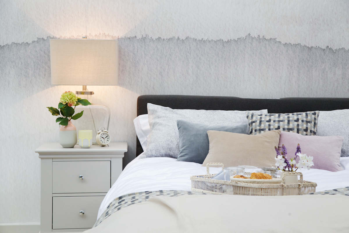
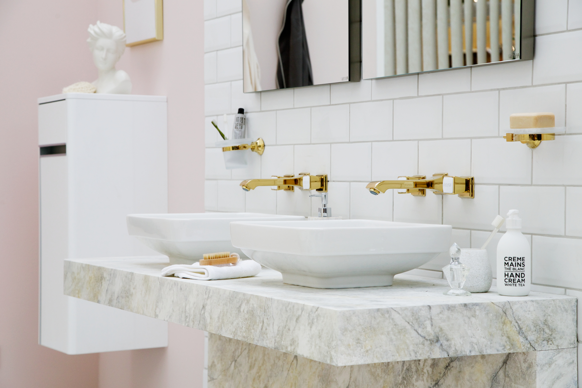
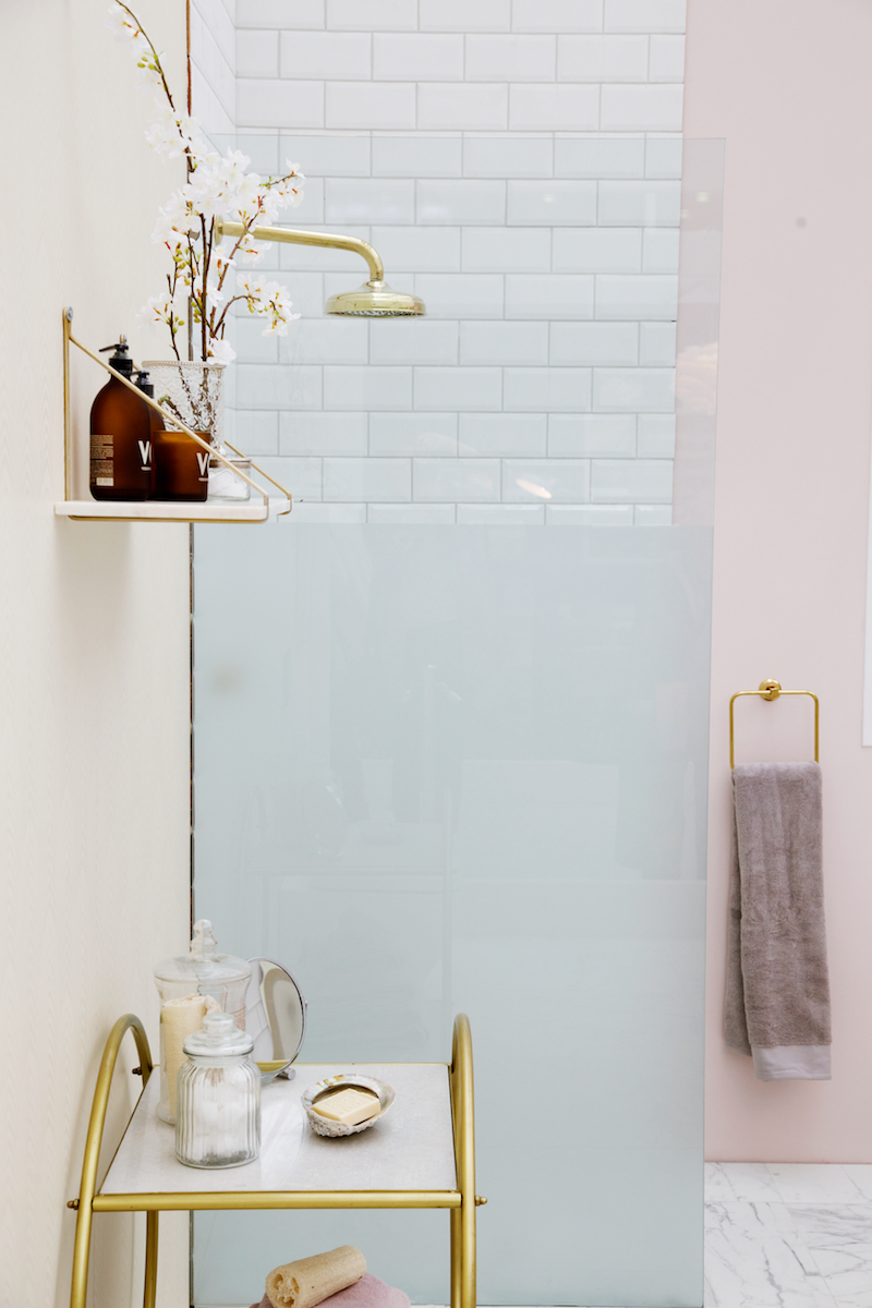
One of my favourite areas though was the Good Homes room sets. Individual rooms like looking through a giant window to a styled haven. I have such a thing for gold bathroom fixtures at the moment so when I walked around the bedroom scene to the beautiful marble and white family bathroom I literally said out loud, "Oh goodness this is lovely!" Luckily the lady next to me agreed and we exchanged a few oohs and aahs over the blush towels stacked neatly in the gold rimmed circular cart. 

The room set features current trends, paint colours we will see dominate this year's home improvement fashions, contrasting kitchen cabinet colours, bolder choices with hardware and marble. Tropical prints and beloved greys and more detail. More on display. Coffee tables with their own styled vignettes, decoration as well as functional practicality. Beauty in a busy family home.

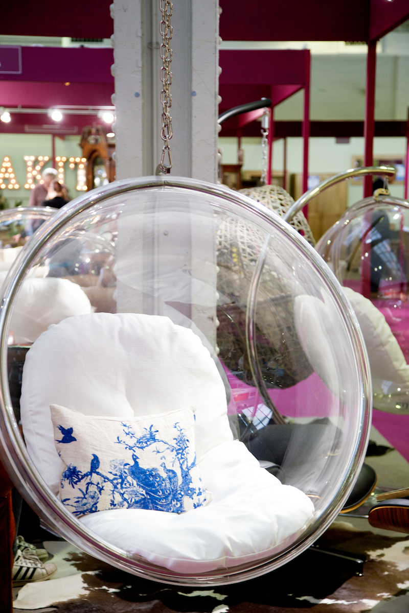
I left the room sets and pottered through the rows of stands on the ground floor dominated by furniture of every description. Modern contemporary gloss next to farmhouse oak tables and chair packages on special offer, exclusive to visitors of the show. There was a grandfather clock maker next to a perspex hanging chair company! And I think it's this eclectic mix of brands you might not be familiar with that gives the show it's unique selling point. 

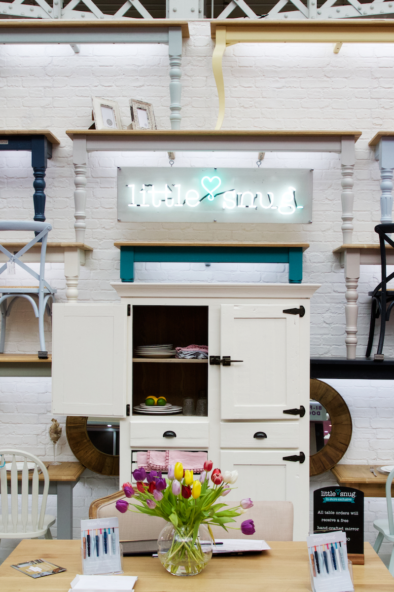
One of my favourite stands was Little Snug a relatively new British brand selling bespoke painted wooden furniture. Incredible value, superb finishes and a choice of colours that couldn't be more my taste if they tried! I loved the way they had really thought through their exhibition, maximising the height of the available space and showcasing as much of what they have to offer as possible. We had a good chat about their marketing plans, the fantastic national coverage they have had already and how they want to challenge the perception of a bespoke product. That quality and value go hand in hand.

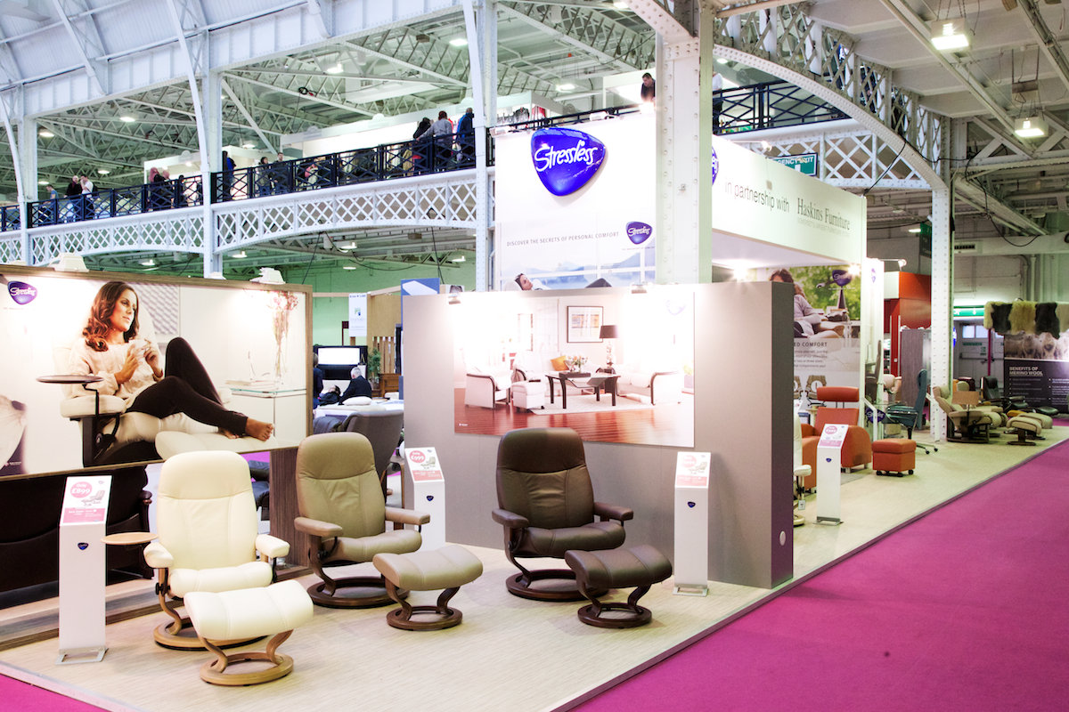
I'd kindly been invited to meet the representative from Ekornes, who were actually based near to me at home in one of their South West stockists and we chatted about the quality of the materials, the craftsmanship that goes into each individual product and how well they know their customer. 

It was so refreshing to hear from a brand who really understands what their customers want - luxury and comfort, wrapped up in a product you invest in. I thought about that scene in the Pixar film Up, when the couple in their younger years chooses a statement chair for each of them that lasts a lifetime. I know I am part of a generation who, rather ashamedly in a way, live in a more throw away culture. Sofas and chairs that are as much of a fashion statement as they are practical pieces and ones that don't stand the test of a busy family life and need replacing as the children head to secondary school. I sat in their office chair and it was a revelation!

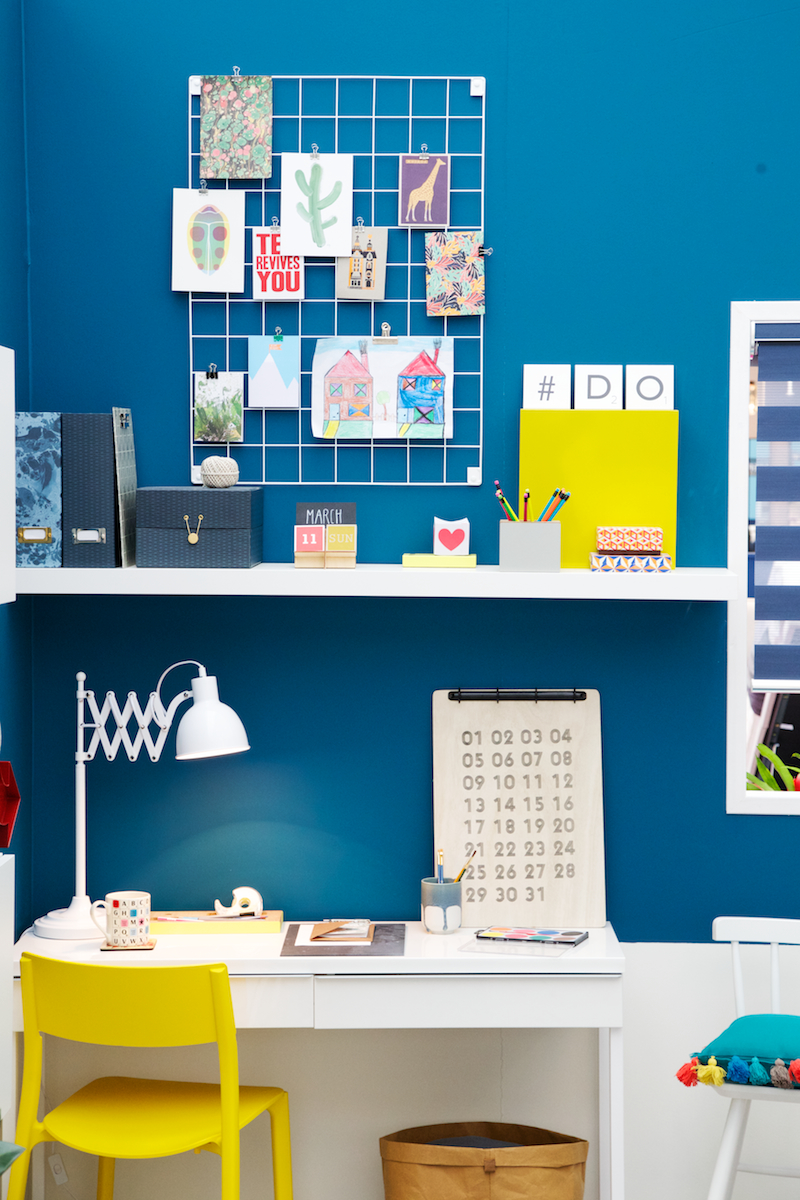
When you work from home it's easy to get carried away with planning the pen pots and which prints would look the nicest above your desk and not really think of the impact of your office furniture on your body. I am so guilty of working on the dining table to save going out to the office above the garage - completely lazy but it happens day after day and I sit hunched over on a wooden dining chair and wonder why my back feels like it is breaking at the end of the week.

I know we need to invest in a proper desk chair and when I lay my head back in the divine black leather and swivelled around on their innovative Stressless glide wheel system like an 8 year old at their parent's office, I joked that it was so comfortable I'd need to take a nap mid afternoon!

I could see why they'd been in business since 1934. These people are passionate about sitting!

The rest of the show is a feast for the eyes. Giant hot tubs that make you want to strip off and dive in, a beauty hall on the mezzanine and a varied food section with live demonstrations and the fanciest chopping skills you've ever seen. By the end of the day the atmosphere felt relaxed and as I wandered I could hear the banter between the exhibitors who had got to know each other well over the 17 day show period. Weary shoppers were taking advantage of sampling a mini manicure and massage and a huge crowd gathered around the Heart radio catwalk to get a glimpse of the last fashion show of the day, complete with Strictly Come Dancing style routines from the enthusiastic models and ended with an incredible performance from a 30+ strong Rock Choir.

Exhibitors stood and watched and clapped as they finished and even though I head to be off by 6.30pm it was clear that many more were going to make the absolute most of their ticket and stay until the end of the late night opening hours on a Thursday. There was a definite sense of fun by tea time and I loved that one stand selling robotic circular vacuum cleaners was helping clear up the mess under a floristry stand and then scooted back over to it's home as the crowd watched in awe. 

But without doubt the highlight of the whole show was the tour of the scale houses. Whilst I loved the innovative nature of the eco home The Arc which we were lucky to be guided around by the designer himself, and could imagine them springing up on plots and Center Parcs' around the country, I felt more at home in the traditional design sponsored by Thomas Sanderson. I would have loved a weekend away in The Arc, with more time to appreciate just how much they have squeezed so intuitively into a space that connects you with the natural world. A green roof, a geo-cooled air system that keeps you cool in summer and warm in winter, the building is an exceptional example of a modular design for modern living.

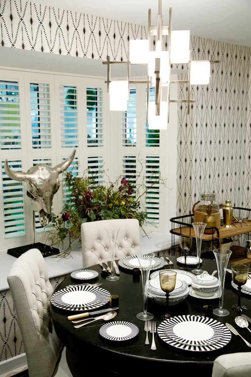
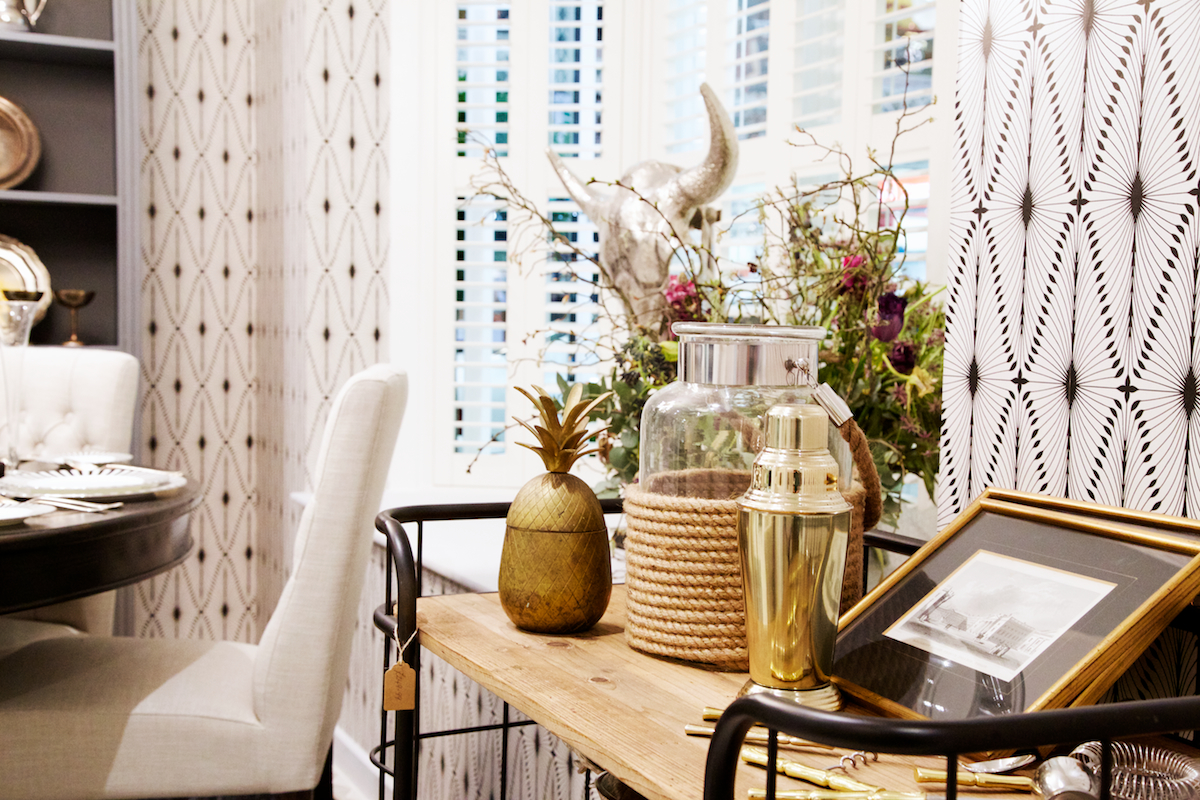
The traditional home may have been very traditional in terms of it's build design, but the mix of print and pattern were far from your new build standard choices. Beautiful Victorianesq floor tiles greeted you in the entrance way which complimented the bold wallpaper in the dining area. A real mix of texture, modern high street accessories and antique plates and vintage silverware tying the metallic concept together. The interior of the house was designed by Linda Barker and whilst the bedroom felt to me as instantly recognisable in her more delicate, feminine style, the rest of the house was a collection of upcyling, statement pieces and curious finishes. 

The majority of the house was fitted with shutters which I loved loved loved! Not a single pair of curtains to be seen just these classic french window fittings and a few innovative blind systems that can be controlled from your mobile phone. It felt so clean and even though I still love the look of fabric against the windows the technology was so impressive you couldn't help but start to wish they were in your home. 

Also on display was their Luminette Blind - a much more elegant alternative to vertical window blinds that I feel should stay firmly in an office environment! Gone are the plastic loops and strings holding them together and instead this material felt like a sheer drape and would be a much more contemporary way to add privacy to your home instead of voile or dreaded net curtains which we had many moons ago and looked so dirty in the windows!

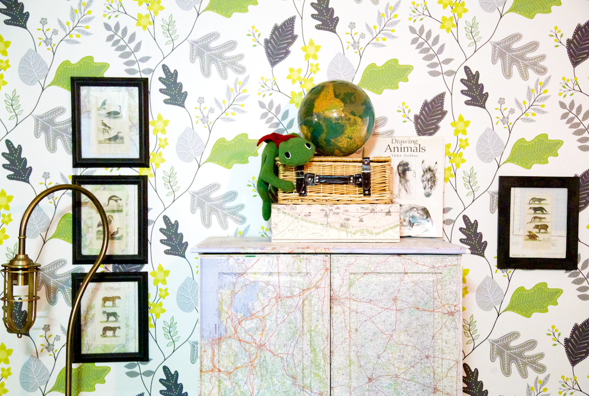
There was quite a queue of people waiting in line to view each house, and I loved listening to the conversations around the rooms like a fly on the wall. The oohs for the vintage maps decorating the children's wardrobe, the deliberations on the copper kitchen taps and door handles. The Laura Ashley paint gave the house a cool and airy feel and the heavier Lombok furniture brought a sense of richness to the bedroom, dining and living room. I loved the gallery wall of botanical drawings and encyclopaedic bird paintings in the woodland bedroom and by the end of the tour I could hear from the crowds that followed that the design had been a success. 

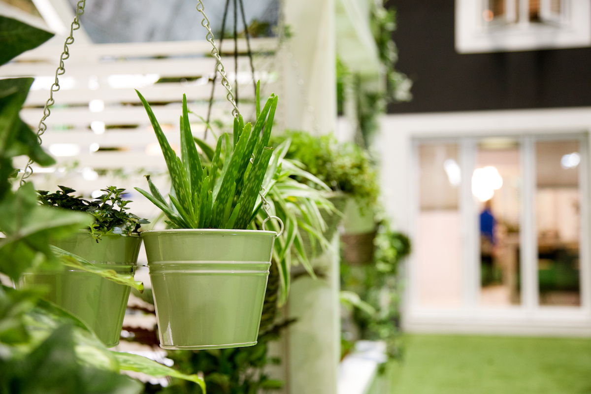
In a way they saved the best for last, a pair of living walls in the conservatory that made you feel as though your were transported to the tropics. 

Without a doubt I would put The Ideal Home Show on your list for next year if you have any remote sort of interest in home interiors. There were far more independent and boutique brands than I expected and it is brimming with inspiration for your next DIY or renovation project. I was surprised by the lack of well know high street names, but in a way that's exactly what the show should be. A place to discover products you may not be aware of, people you can't find walking around your local shopping centre on a wet Saturday afternoon. It's an ideal treat day out for anyone interested in design and interiors or looking for inspiration and advice for their next DIY project.

And I am now completely in love with the idea of shutters and a conservatory valet. I came home and all I could see was how dirty ours looks! 

The Ideal Home show will return next year from 24th March to 9th April 2017 so follow on Twitter for your chance to get tickets when they are released. Thank you to Thomas Sanderson for your hospitality and to Ekornes for a delightful product tour.

Gluten Free Mother's Day Gifts • Honeybuns Bakery

Some of you will know I work with the very talented people at Honeybuns and shoot their product photography. We had an absolute ball over last summer photographing their second book to be released this year (I am sure not all book shoots are that much fun, laptops in the middle of fields and feasts for lunch after we got the magic snap!) and it really opened my eyes to how yummy gluten free cooking can be.

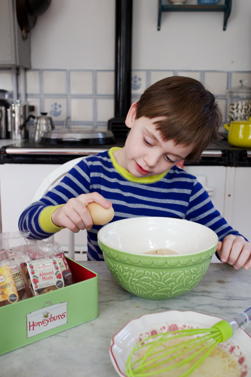
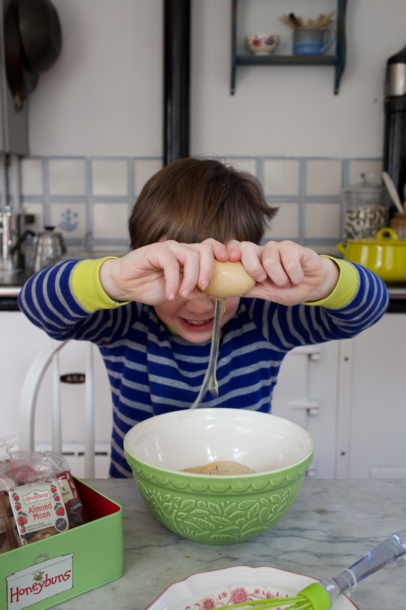
I am a self declared hopeless baker but with their wonderful afternoon tea hamper even I couldn't go wrong! And just in case I enlisted the help of two mini bakers. One who couldn't stop smelling the mix and one who turned photographer, snapping Sammy and I! 

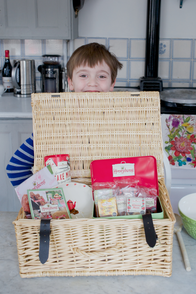
There's something so gloriously luxurious about receiving a hamper, I have a hundred uses for the basket afterwards and not only do you get a selection of their cake bars in a reusable tin, but you also find the sweetest tea plate and a packet of their gluten free sponge cake mix nestled in the shredded paper. 

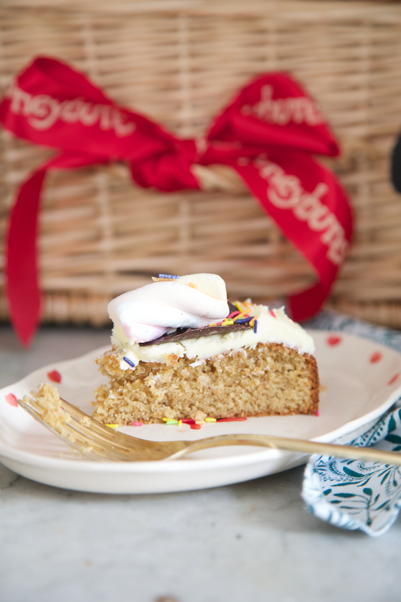
I defy anyone to tell me gluten free isn't as tasty or even tastier than a regular sponge. The almond flour and vanilla powder are subtle but make the difference. Topped with anything the boys could get their hands on they were so proud of their masterpiece!

It was so good Rich and I ate it for breakfast this morning! Well elevenses ;)

Check out their fabulous range of goodies to gift to your mummy this year or send a link to your other half as a not so subtle suggestion!

There's something for every budget from a Tinker Tin at £4.99 right up to their super duper deluxe hamper and everything in between. So whether you need to eat gluten free or not have a peek.

Tomorrow is the last day for orders so you still have time for a last minute idea! 

All gluten free and having personally tested alms all of them over the last couple of years I can tell you completely delicious!