Posts in Blog Bits & Bobs
How to develop your Instagram style & grow your following #BlogCampVibe Part Two

An Update (22/11/15)

I would like to reiterate that these How to Develop Your Instagram Style & Grow Your Following posts (parts one, two, three) are a summary of my talk at BlogCamp Vibe, which was a development of my earlier guest post at Ebabee about Instagram, and my sessions at BlogCamp River Cottage, as well as being informed by other guidance on Instagram published online.

Lucy


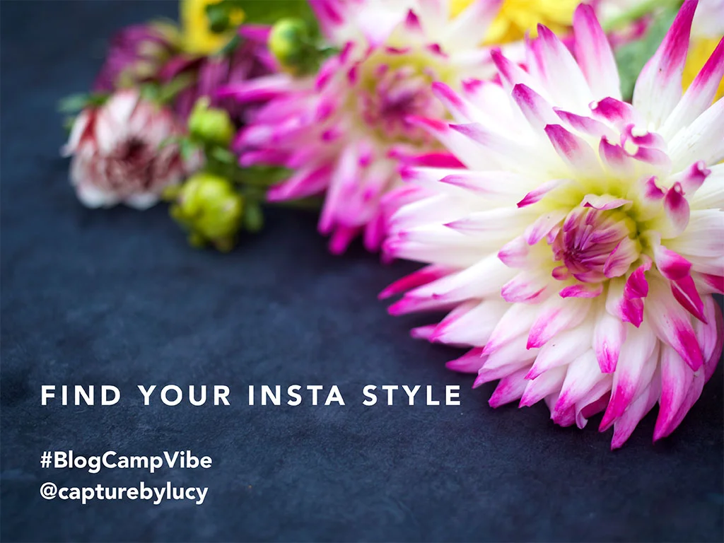
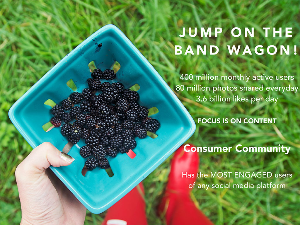
Thank you so much for all the love for Part One of this series of posts designed to help you find your own style on Instagram and fall in love with everything the platform has to offer. These posts are for people who want to proactively develop a recognisable style, to compliment their blog or business and consciously look to engage a wider following.

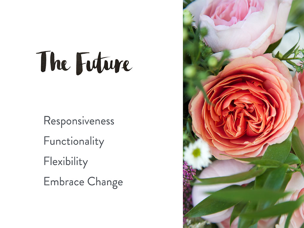
Part Two is all about that elusive rhythm that some accounts seem to effortlessly exude and how you can find your own flow for your feed.

These aren't do or don't posts. They are observations from my personal experience and from my research from the Instagram blog, journals and articles published by passionate users. I've worked really hard over the last year to grow my following, taking time over my styling, capturing moments on the go in a more considered way to share the best quality photography from my phone and Canon as I can. 

If there is only one thing you take away from this post - let it be this. Quality is waaaaaaaay more important than quantity. It may sound obvious but I want you to view your feed with a much more critical eye. 

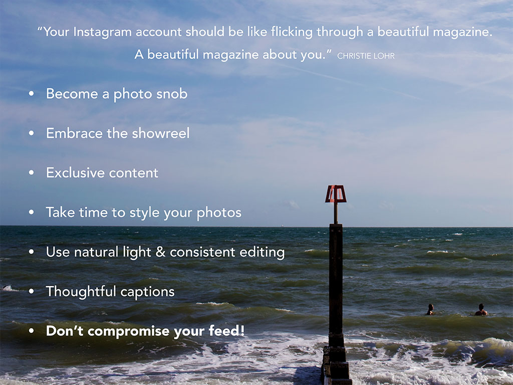
TREAT YOUR FEED LIKE A MAGAZINE - A MAGAZINE ABOUT YOU

You want people to feel like your gallery is one of their favourite books that never ends. That everyday there might be a new chapter.

I view mine just like my blog. In fact over the summer it literally kept my blog alive! I found this summer particularly challenging in terms of juggling the school summer holidays, photography work deadlines and we had a silly number of holiday commitments for big family birthdays so my Instagram account became my saviour. There were times when I just couldn’t keep up with even a weekly post on my blog but I used my feed as a mini blog. A daily journal of all our adventures. I still need to blog our trip to New York and Paris. And that will be almost 3 months after the event!

It may not sound very attractive but photo snobbery is essential! Blurry, badly light, orangey photos are not for your feed. Resist the urge to post them. If you want to use your account as an extension of your blog or brand, to promote your work and grow your following then you need to view your account like your showreel. It's a platform of highlights, it's not like Facebook where you can share an album of 75 holiday photos or 25 pictures from a trip to the zoo. You want to pick your best to share, and only your best. How many times do you tweet the same link? 3 times a day?! You wouldn’t share the same photo 3 times in a day or three from the same post to Instagram - it’s just not right for the platform. If you have great photos from a blog post spread them out over a period of time, encourage people to read or re read the post! 

Be mindful that people catch up on their favourite accounts at certain times of the day. You don't want them to see three in a row of the same recipe, the same trip to the beach, or the same event. I have photos in mind I want to share over a week, and I use them to break up the "instant content", photos from where I am at that exact moment. Styled floral shots, photos from a blog post I'd like to highlight.

Your feed is your gallery - an exhibition. It’s like a blog post in just one photo. 

EXCLUSIVE CONTENT

I hope that I give people added value - a reason to follow me because I post a lot of exclusive content. I'd hazard a guess that 90% of my feed won’t be shared elsewhere. Now I know you can link your accounts, and now that Instagram has moved outside just the square crop you can share the same photo without needing to re edit for a specific platform, (Portrait for Pinterest, landscape for Twitter and Facebook) but I wouldn’t do that every single time.

Sometimes I see people’s Twitter feeds that are just auto tweets saying "I just posted a photo on Instagram..." Instead pick and choose and watch your engagement go up!

I have lovely blogger friends who share the same photo at the same time, to Instagram, Facebook, Twitter and then it might pop up on their blog a few days later. And I just won’t comment or like them all, or engage with them. Think about whether you have a high crossover of followers, if you do, be more picky about which you share to several platforms, give people an extra reason to be curious about what you might have posted that day, not a reason to scroll past without hitting that like button because they saw it on Facebook earlier in the day. 

Take your time. Don’t post in a rush. Ok so we don’t have to be like Kim Kardashian who reportedly has taken 300 selfies before she gets the magic one! But do take a few. I can set up a flat lay (everything laid out on a surface, all at similar heights) and take 20 or so snapshots on my phone of the same set up. That gives me weeks worth of first thing in the morning cheerful images!

Move washing out of the background, look at what else you can see in the reflection of a mirror. And whilst I am on the subject of selfies... I've noticed that the super popular accounts feature less of the photographer themselves and far more about their view on the world from behind the lens. Sure people want to see who you are, but perhaps not everyday. 


We all know this but we still ignore it sometimes!!! 

NATURAL LIGHT

Everything and everyone looks better in natural even daylight. Living rooms look dark and orangey if you snap a photo of X Factor whilst you are watching it! Keep those photos for your Facebook, where the audience is generally less discerning.

I look back at some of my early photos and cringe. Physically cringe. 

Pinky filters, distorting true colours, whites that look cream and not in a good way. The heavy borders, lots of different text fonts all over your photos that were hugely popular a few years ago, that aren’t so much now. Remember when the A Beautiful Mess app came out?! Ummm hellooooooo 20 different text fonts, symbols and illustrations! But have you seen them even on Elsie and Emma's feeds lately? Nope. 

Save your fancy fonts for annotating your blog photos for Pinterest. Let your photos breathe. Use the new Instagram Layout to share collages rather than use funky coloured and patterned collage apps. They instantly make your photo look less polished. Simple white or black borders can be effective - but use them sparingly. You want people to see your content, your beautifully composed image, not be swallowed by a border!

FILTERS

The really heavy vintage filters can look outdated so be filter aware! Take a piece of white paper and hold it next to your photo if you take something on a white board and see how close it is to true life. 

Find one or two that suit your style and stick to them! I got carried away with suffocating my photos with illustrations. I shared photos of my gorgeous niece but you could hardly see her for all the hearts and script font quotes plastered all over the image. Now I just wouldn’t clutter the photo - I want the photo to tell that story not a great big caption all over it!

I tweak almost every single photo, now that may sound over the top but my feed is my living cv, for new photography clients to find me and like my styling and editing style. 

My favourite app is Faded which is for iPhone but I’ve seen great write ups about Camera FV-5 for Android and other popular apps include PIC TAP GO, Afterlight and VSCO Cam. I use the same two filters on Faded which help brighten and lighten, like having control over exposure if I was using my DSLR.

TELL STORIES WITH CAPTIONS

Really think about your captions, the limit on Instagram is much less restrictive so if you have a story to tell which enhances the users experience of the photo tap away! The food photographer and blogger @marte_marie_forsberg does this so well. Romantic language, whimsical story telling which her followers can’t get enough of! Some write in poetic verse, this is definitely a platform where you can flirt with the English language. The super cool seem to start their captions with a single word which encapsulates the image then expand with a few sentences. 

Do you have a read more option on your blog - where you see just an excerpt first that entices your reader to click through? Think of your caption like that. It’s another way to share your unique voice.

Do what feels natural to you. Don't try too hard. 

If it's not really use to use quotations or folksy terms then that's fine! Sometimes I have a lot to say and other times I keep it short and sweet. Stick to your authentic voice and your integrity with attract followers from far and wide.

DON'T COMPROMISE YOUR FEED! 

Don’t post for the sake of it, I’ve felt the pressure at an event to post, or had zero signal and then wanted to share a number in the evening but no photo is better than a poor quality photo! Don’t let rogue photos spoil your feed! Like typos, when you see them correct them! Both in your blog copy and in your captions!

Resist the urge to blast your feed when you log onto a wifi signal. Save them, tease your audience with one. Your best one.

I went to an event with a lovely interiors company recently and we were taken to a beautiful restaurant for afternoon tea. A dark restaurant! Beautiful flowers, amazing food, dreadful lighting. I ended taking about 20 photos of the pretty cakes before I felt I had one I could share that just about fit with the quality of the brand. I still am not 100% happy with it every time I see it. Then I waited until the morning and styled some bunting from the goody bag and shared a much nicer, much better quality photo which I know was more in keeping with the style of the brand’s own photography!

HOW TO USE YOUR FEED TO CONNECT WITH BRANDS YOU LOVE

If you want to engage and be noticed by the brands you respect and admire, you want to show them that your photos would sit comfortably on their feeds too. Mobile phone shots can still look professional you just need to be smart with your composition, lighting and editing. Look at their professional photographs, look at how they style their products. Use their feed as inspiration. 

TIME IS OF THE ESSENCE 

WHEN you post is so important and although I take my feed quite seriously, I am still haphazard with my posting. I don't have a morning routine where I post at almost the same time every day. If the school run preparations are going to plan I normally post around 7/7.30am if we are behind and I am clucking at the boys to get out of the house like mother hen it can be 8.30am or later before I share the first image of the day! 

And it definitely has an effect on my engagement. 

Out of interest how many times a day do you check your feed? Honestly, how many times? 10 times? more than 10?! More than 20?!

There are natural peeks in user activity - think about the general demographic. so on the east coast of America a study showed that 2am and 5pm are the best times to post where users are at their highest! Young-uns still up in the early hours and the "just clocked off work" catch up on your news feed.

But who are you followers? I have a strong parent following - so I see a natural surge in likes if I post early in the morning but not too close to the school run, after lunch time and then around 9pm, when my followers in America get home from work or Australia when they wake up!

You want to give your followers a feed to rely on - they follow you because they like what you post! So if you look at someone like @emilyquinton she starts everyday with a floral “good morning”. 

THEMED ACCOUNT SUCCESS

There’s a reason themed accounts do so well, but repeating the same theme doesn’t mean it has to be stale or samey. Look at how Emily plays with florals, changes the atmosphere with backdrops and props or check out another favourite of mine is @booksandteacups - you can guess what she shares a lot of!  @gingerlillytea is a great example from our Tots100 community - her style is so distinctive I can spot a photo of hers a mile off. Kerri-Anne shares fairytale images, featuring woodland, her children and doesn't compromise her curated feed with snapshots of "everyday life". Of course it is her life, but she saves her snapshots for another platform. 

Themes come in all shapes and sizes. There's famous accounts for pigs, dogs, pet hedgehogs. matching breakfasts and if they posted lots of times in a day you might think it's too much! But a single photo can have such cheer. If you see your followers really respond to a particular theme, florals, food, family, why not try and week where you concentrate more on sharing similar content?

Some consistently share DSLR images and that's ok too. Don't feel like you are cheating if you share a photo from your "big camera" It's your feed and if you are proud of a photo share it! I actively shared more photos over the summer from my Canon to join in the official Canon hashtag. Don't feel like a fraud if it's not from your phone. 

I don’t feel pigeon holed to one type of theme - flat lays or white negative space - in fact most of my photos lack that illusive negative space!!!

I want my feed to reflect me and my true life, we live a hectic life my husband and I both run our own businesses, but I HOPE my photos have my consistent style over them. Sharp, in natural light, styled and colourful! I clear backgrounds, move the the piles of Lego, school uniform ready to be ironed and hide the recycling on the side of the sink. I promise it is there, (Here's the proof) it’s just not appropriate for my Instagram feed. I sometimes play with muted tones later in the day but they always stand out to me as experiments rather than my natural style.

CONSCIOUSLY PLAN YOUR FEED

Like your blog have a strategy, I like a mix of "here's one I shot earlier" content, seasonal floral still life photos that I have queued up in my camera roll and room for spontaneity. 

I went on a food photography course with Emily Quinton and Catherine Frawley and it was a bit of a wake up call. Emily is open about her desire to grow her following significantly and she talked about how she really started taking her Instagram seriously this year. She’s seen her following grow from 10k to over 58k and she is open that one of her goals is to grow it beyond 75k And this is all organically! That is amazing. 

She’s honed her style - she knows what her following wants and gives it to them 3 times a day.

So when you post - don’t blast people! People will unfollow if you clutter their feeds too often.

I try to not post more than once every two hours now (Unless I am joining in with #1day12pics) and this definitely helps with engagement. I'm experimenting with sharing just three images a day even though I have to physically force myself not to share more! 

So don’t be tempted, if you are at an event with no wifi (I mean who would send bloggers on a event with dodgy wifi?!!!!) to get home and upload 5 in a row, even two in a row. Think NO NO TO POSTING IN A ROW!

Sara from @me_and_orla has a distinctive colour palette and when you scroll through her feed you can see her aesthetic coming through. She runs 1:1 coaching as well as the Insta Retreat which is a great source of Instagram advice and one I have learnt so much from. 

ANALYTICS 

Does everyone look at their analytics?! Where your blog traffic comes from etc? Ok great, but we should all be doing the same for Instagram. Your statistics can help you see which photos were most popular, which got the most comments, the most likes, who your demographic are, where they live etc etc. 

I know that if I just posted florals and our home my engagement would be greater but my feed is an extension of my blog, it’s a way I collaborate with brands and I want to be able to share all my interests with my audience, rather than just work with listed building officers and florists! I also want my daily feed to be a way that my followers get to know me. The way I see a street or capture a moment, not just what I know will get the most likes. I've decided to share photos that I know won't be the most popular but ones that I'm proud of, or ones that connect me with a new audience. Like joining in with a specific community outside my comfort zone - #myseethroughiphone. 

When you use your Instagram account as a way of featuring a brand’s products or promote a particular campaign you don’t want a post that’s part of a collaboration to stick out like a sore thumb. Bloggers are such a powerful group, we create lifestyle content in real homes, as real families and that is something so valuable to brands and companies. I work for lots of different brands now to create that “blog” style content for them for their websites and my Instagram feed is another way to show them my style of lifestyle content.

Use sites like Latergramme to schedule posts, Sprout Social (Paid service after a free trial) and Iconosquare (Free) can open your eyes to your Instagram statistics. 

Latergramme shares some amazing posts on takeaways from their social sessions for growing your feed like this one, with great advice from long term users. 

It's not about being a slave to numbers it's about gathering all the information that is available and making a conscious choice. I have chosen not to go back and delete the photos that rather embarrass me now because they tell my unique story. I can see what influenced me at the time, the fashions and trends and it's all part of a steep 18 month learning curve.

If you want to go back and edit your account feel free! There is no right or wrong answer. And maybe think twice before sharing those Timehop photos to your feed, pop them on Facebook instead! Photography skills improve with practise so don't spoil your quality images of today with a random image from 3 years ago. 

Be mindful, be proud. 

Tomorrow is all about the great hashtag debate. To hashtag or not to hashtag that is the question. Or rather how many hashtags should you hashtag!!

You can see the full presentation over in Part One

How to develop your Instagram style & grow your following #BlogCampVibe Part One

An Update (22/11/15)

I would like to reiterate that these How to Develop Your Instagram Style & Grow Your Following posts (parts one, two, three) are a summary of my talk at BlogCamp Vibe, which was a development of my earlier guest post at Ebabee about Instagram, and my sessions at BlogCamp River Cottage, as well as being informed by other guidance on Instagram published online.

Lucy


It's a great privilege to be asked to speak at events and share what I have learnt over the last 4 years of blogging. Most days I feel like I have everything to learn myself but I also think it's so important to share. Share what you know, help others grow and everyday I meet someone, or read something that makes me feel inspired. 

It always throws me, at events like the Tots100 event #BlogCampVibe, when people say after a session, "Wow thank you, so many don't seem to want to share what has helped them grow their blog." And I never understand that. There is room for everyone in the bloggersphere. We all have a unique voice that we can establish, nurture and develop. Don't get disheartened or be a slave to comparison. Be yourself. 

There are no prescriptive right and wrong answers. The best advice I could give anyone starting a blog today is read as much as you can, soak it all up like a sponge like when you first start school. Be wide eyed and enthusiastic. When you feel inspired and passionate it shines brighter than any fancy statistic, any impressive follower numbers. Everyone can be successful, you just have to find what makes you feel alive and I promise people will hear you.

Now I know some people can't stand How to posts and Top Tricks and Tips type features but I find I learn something from every single one I have read. I have vowed to never let myself become so arrogant as to think I know it all. We can all write with more eloquence, we can all refine our design or improve our technical photography skills. There is always something we can learn from each other. 

There are some amazing resources on the internet, workshops, e-courses and free taster workshops as well as courses you might want to invest in. You can sign up for a free Makelight taster course with Emily Quinton, Sara offers both 1:1 coaching a 7 day Insta Retreat course at MeandOrla.co.uk, Love & Colour have a new Insta Workshop and I have just signed up to a videography course with Xanthe Berkley

Over the last year I have blogged a lot about a platform that has quite frankly changed my life. 

It's changed the way I blog, it's changed the way I work and it's become a huge part of the positive energy I need to cope with a very hectic period in our lives. 

And I want to share a little, or rather a lot, about the things that have helped me, that have organically helped me grow a following that makes me squeal in disbelief and has allowed me to connect and engage with my audience in ways that other platforms just can't.

This is my Instagram story.

These are the things that I and other's I have read over the last year about think can help you. Tangible things you can be conscious of and chose to ignore if you want to! This is a post for those of you who want to proactively engage the following you have already and grow the following you'd like to have in the future. 

If you use Instagram as a hobby fantastic - enjoy it! But if you want to really take your feed as seriously as you do your blog, brand or website then this is the post for you! 

I truly believe anyone can be successful if they find their style, hone their aesthetic and connect with their audience. If you look at the super successful bloggers in the Tots100 who have huge followings on Twitter or Facebook or Pinterest they often don’t have the same significant following on Instagram. Even the big blog networks themselves haven't achieved the same growth on this unique platform. Each platform has their own set of users and some that cross over. And when you find out what makes a platform individual you can start to subtly influence the way you use and post to each. So I'm not ashamed to say that I want to give my followers on each platform something slightly different. I consciously choose to share content in different ways to appeal to my different audiences, and give the people who so kindly follow me everywhere a reason to keep following. 

You can look through the whole presentation in your own time but there's too much to fit into one post. Instead I am going to talk through 2 or 3 slides at a time over a few days, so that I can hopefully tell you everything I said at #BlogCampVibe and you'll feel like you were with us!

JUMP ON THE BAND WAGON

Is it just me or does Instagram feel like the cool platform the hot thing to be on right now?! There definitely seems to be a shift over the last year with more national brands joining Instagram and they’d be mad not to!

Just look at some of the latest statistics! They are mind blowing numbers. 

Content is just as important on Instagram as it is on your blog. About 6 months or so ago I realised that I was only sharing photos to my feed that I would share on my blog. And even though they are 95% iPhone pictures, to me they are stand alone images. 

Instagram is the fastest growing platform and gives you the potential to grow a global audience. It’s where real people live! The vast majority of my followers are real people like us! I feel so lucky that companies I adore follow me back but generally it's a platform made up of consumers. Teenagers, students, parents, couples and singles sharing far too many inappropriate direct message pictures with this married mother of two! Good grief!

The interesting thing about this platform is that the users are pretty evenly divided between men and women, Demographic stats show a relatively even ish spilt between users living in urban, suburban and rural areas, 28%, 26% 19% respectively and there’s a high concentration of users in their late teens to late twenties with the majority of followers in a $50k PLUS income bracket. It's a place brands want to be seen on, to share their products in the most natural way. (Stats via SproutSocial)

And the thing with this platform is that you can see the engagement in an instant. 

Twitter and Facebook may still be the leaders for sharing content but the difference between likes and comments, retweets and favourites is significant. Because there’s no distractions, there’s no clickable links no extra noise! Don't you sometimes check your Twitter feed and for a minute or so, feel like you can't figure out what you are meant to be drawn to. It's just link, link link. McDonalds recently ran an all day breakfast campaign and 2 Instagram posts received more engagement that dozens of pinned tweets combined! 

FIRST IMPRESSIONS MATTER

Your first impression is so important. In real life we take 7 seconds or so to make a judgement about someone or something but online this is about a tenth of a second! People make snap decisions about whether to click that follow button and what you want to to entice them with those first 3 images and make them disappear down your feed! You want them to get lost. 

I see in my notifications that often a new follower will then go and like 5 or 6 or sometimes more photos, some from months and months ago. I can physically see that they have got a little lost scrolling back through my gallery. I do it myself. I look through a favourite's account, then I look at who they follow and start scrolling and before I know it I've lost half an hour to eye popping gorgeous inspiration. 

THINK ABOUT YOUR PROFILE

Think about how people might find you. I spot all the time that people have different user names to their blogs or handles - make them consistent with your other channels! Make it easy for people to find you. 

Like wise with your photo - keep it consistent - if you have a logo great, but think about the type of people on Instagram - real people - they might prefer to see you! 

Really think about your BIO - don’t just copy and paste from somewhere else, think about how the users differ on Instagram. What do you want people to know about you - what interests do you have, set the scene for your feed. Write not only for the audience you have but the audience you want to attract. I want people to know I share a lot about our house and the fact that we live in the countryside. We travel, we hare all around the country seeing friends and family, we eat out, have our heads turned by beautiful product packaging, but my home is the heart of my feed.

I want people to know, that even though I don’t share masses of photos of the boys that I am a mother, that my job is that I’m a Blogger and Photographer and that I tell visual stories. Sometimes I use the comment and caption box to tell as much of the story as the photo itself.

LOOK AT YOUR GRID

Think about what your last 3 photos or like I do your last 9. What do they say about you. Do they give someone a real indication of what they can expect if they follow you? Do the photos compliment each other - do they show what you are passionate about, what you love? If you share similar images everyday, like your breakfast or your outfit is the light consistent, are your whites white? Or does your feed, when you look at it as a whole look a little grey? Your whole feed is as important as an individual photo. There's a big trend to post against a white background and all over the world people are photographing their shoes, their magazines, their lunch and inspirational postcards (YEP I'm guilty of that!) against a funny sheet of card they pull out from behind the sofa. But be white beware! Don't let your feed turn into fifty shades of grey. Take those photos in good, even, late morning light and store them for a rainy day!

GET CREATIVE

There’s ways to be creative with your bio, some centre their text, whereas I like mine left aligned. I see people using interpuncts, brackets and braces (The swirly brackets on your keyboard). You can use apps to change the standard font - like Textizer and because Instagram is a more light hearted, positive platform you can show your personality! People use emojis, I’ve seen brands with great fun lines in their bios and just look at @brightbazaar - Will Taylor - a hugely successful UK interiors Instagrammer.  He spells out quite clearly what you will get from following him and uses emojis to give it a playful feel even though he obviously takes his feed very seriously, sharing beautifully composed and edited snapshots as well as professional photos.

You can play around with the clickable link. Why not edit it as you publish a new blog post or if you are up for an award then let your followers know and direct them to the voting page! I am so guilty of sharing long url links but what I will do in future is use a shortening app Bitly or Google have an app so that it doesn’t appear as this great long link and clutter your bio! 

Just be mindful that if you do play with formatting - the vertical spacing etc - check how it views on mobile and web as lots view profiles from a desktop or laptop. And sometimes it can look a little skewed! Like the formatting has gone awol!

Tomorrow I am going to talk through the importance of quality over quantity and finding your own rhythm. So pop back and have a read!

And if I have missed anything - leave a comment - I'd love to help if I can. 

What do you feel you love or struggle with? Do you feel you've found your style on Instagram? 

Blog Design Presentation • Define Your Design BritMums Live 2015

When I started putting this session together with Teri I spent hours researching better blog design presentations, how to improve your blog design posts and how to DIY your web design articles! And they all became a variation on a theme.

There are fundamental principles that aren't to do with personal taste or style they are the basic foundation to a more efficient, user friendly website, with the ultimate aim of giving your reader a better experience. Because a better experience will communicate your content more effectively and make them feel like they want to come back and read again.

This is a mammoth post. But one to bookmark for when you have time and if you really want to define your design.

If you missed the session I hope these notes and slides will help you find a clear direction for your blog design or perhaps challenge your current thinking. I found myself analysing my site in a whole new way, things I knew that needed changing months ago but have been lazy, things that should have been glaringly obvious and Teri's experience as a designer has absolutely made me redefine both my objectives for my blog and its aesthetic. 

Sometimes it's easy to know you want to change something but you don't know how. 

So start at the beginning. Your Audience. It might not immediately feel like it has an effect on design, but it’s the first thing to think about. Do you know who reads your blog, could you profile them? Do you know their rough ages, whether they are male or female, are they predominantly bloggers themselves or outside the blogging community?

Knowing who your audience is will help you tailor your design. We all follow people for the same reason, that we like what they post. We all have our favourites for writing, favourites for photos, blogs we check first thing in the morning on our phones before we’ve even brushed our teeth! We get to know how their site looks and feels, and how it makes us feel.

I have quite a varied readership across the different social platforms. Remember people find your blog or website in different ways. I have the very loyal, incredibly supportive parent bloggers who have followed my blogging journey over the last few years, friends on Facebook who use it as a way to keep up with our hectic lives and friends of friends on Facebook who might just be nosy! Fantastic, the nosier the better in my book! Then I have this relatively new Instagram following, who I want to slowly convert to blog readers. My more styled photography is more popular on that platform whereas my more "real" everyday snaps have a greater engagement on Facebook. It's about balancing your overall aesthetic to appeal to your audience.

And that’s where “what do you want them to see” plays a big part. I want readers to see a professional looking blog, a mini digital magazine. It’s grown from a personal diary to something I hope people can use as a resource one day. I want my design to reflect a positive, happy, wholesome but aspirational feeling. Whatever the content might be your design creates an atmosphere. Bar the odd personal outpouring of course I want to create a site that will be cheerful to read. Bright and fun photography with my voice.

I’ve been stuck in a design rut for about 9 months. Too scared to make big changes, not quite sure what I wanted to convey. Am I a photographer, am I a mummy blogger, am I a lifestyle blogger, am I none of those and completely lost?!!! 

You need a plan of action. Back in March I went on a fabulous course about colour theory, which I will touch on later. And after that course I had several epiphany moments. All I could do at the time was write them down, store them away for a rainy day when life calmed down and slowly it’s becoming the right time. And those ideas are formulating into real plans, a strategy for a product line, a definite path to follow that feels right for me.

Your design can help you set your goals. What do you want to do in the next three months, in the next six, in a year? Think about how your design can achieve them. Do you want to increase your email subscribers? Have you thought about where you encourage those subscribers on your page? Take blog awards as an example. Putting a badge way down in your sidebar is not telling the readers who LOVE your blog that you would be so happy for their vote!

Setting specific goals are a great way to see how effective your blog design is.

So if you set yourself a goal to increase your subscribers by 20% how are you going to adapt your design to achieve it? Are you going to add a pop up box when someone lands on your site, have a sign up form at the end of each post? Look at your analytics, is there a particular older popular post that people re read? Add a sign up form at the bottom of it! I did a cocktail post well over a year ago, and because it was so well shared on Pinterest it’s still one of my most popular posts each month. Now what should I do that I haven’t?!!! YES amend the layout of that post to include a sign up form, perhaps add photo links to my other cocktails. I am missing an opportunity!

Write down somewhere what is the one thing you’d like to achieve after reading this post. a measurable goal. More twitter followers, more IG followers, more comments? Then look at your design, what could you do to help achieve it.

Your layout is how every piece of content on your blog visually fits together with each other. It's what people get used to but as much as we want to encourage habitual readers we also want to grab their eye and encourage them to read the important bits!

ALIGNMENT

So often I see blogs with beautiful words and photos but nothing is aligned. This is the first thing that is the easiest to change! It's not a styling choice it's ineffective design. Your text and photos should all be the same width so they span the container. If I stretched some of my phone photos they would be horribly blurry, so the way I deal with that is to arrange them in a collage and that way I can still stretch the whole image to the same width as the container. 

I see so many blogs with centered text and immediately want to align it! It makes it so much harder to read, especially on a phone or in long paragraphs and is one of the very basic principles of good web design.

COHESION

Same goes for your sidebar. So who will admit to loving the Daily Mail sidebar of shame?! So now who will admit that maybe their sidebar is a sidebar of shame too?! Mine is! Different logos that don’t compliment each other, all different sizes, different fonts. It's a muddle and it's not effective. It’s not clear what is the thing I really want you to concentrate on. Be brave, have a side bar spring clean in June! Approach your sponsors or brands you promote and look at how you can uniform your sidebar. 

Creating a cohesive design is tricky, you might have linkys you join in with that you love, or adverts you have to feature but think about how they fit together. do they compliment the logo below? Is there any cohesion between them?

REPETITION

We humans love routine we are not designed to process large amounts of data we think visually. And change often scares us or we feel disconnected at first with something new, so creating a recognisable repetitive layout is a good thing! We want readers to know how to find things on our sites, get familiar with our layout and navigation. 

Remember so many view blogs on their phones, they scan rather than read. Does your layout make that easy?! Are your posts like mine and photo heavy and can take forever to load? New readers might not be inclined to stick around! Would your readers benefit from a “Read more” button instead of scrolling endlessly? Would that mean they could view a few posts on your homepage and could re read those they missed or just scanned briefly? Think about the number of posts per page. Look at how the A Beautiful Mess sisters have a round up of posts at the bottom of their landing page and categories in their footer, clever right! Designed to make you stick around longer!

NAVIGATION

Look at your navigation - your categories, are you giving people too much information? What do you want them to see? If you want more commissions, more sponsored posts or reviews, make that more prominent in your navigation. A work with me category, make it easy for brands to find a contact form. Use drop down menus if you want to share lots of content without overloading people! You want people to feel like they are on a special journey of discovery, draw them in and make them delve around and lose an hour without realising!


When you analyse your layout which pattern are you following? There are 3 main principles in web design which all emphasise the importance of layout and how your content is read.

Some of your blogs might naturally fit into the Z or F pattern layout, or you may have a homepage as your landing page which you want to analyse against the Gutenberg Diagram. Assess your blog layout against these diagrams, what have you got in the strong optical area? Are you leaving important info in the weak area? 

We all scan, we all scroll madly on phones, how often do you look at how your blog reads on a phone?

It’s too easy when you have been blogging for a number of years to get complacent. To see your numbers steadily rise. Organic growth is fantastic but it also makes us lazy with design. As bloggers we are masters of our own design destinies. 

We love our sites like they are our babies, like you are in this secret society of bloggers which “normal people” don’t fully understand yet! But those normal people are an audience just waiting to be found. Very quickly our blogs can go stale in terms of their aesthetic, look outdated and unprofessional. It’s not about whether you blog as your profession it’s about conveying a professional image. It’s tempting when you have been blogging for a number of years to overload your navigation, show horning everything you’ve ever written, but look at your analytics! I have side bar links that never get read! I need to change it up! Think about how we are all inspiring the next generation of bloggers. We want people to land on our sites and think WOW! 

I went on a course in March and was blown away by how little I knew about colour theory. I hadn’t thought properly at what the colours all represent, how I should think about how a colour looks when it is printed and how different colours work together in different ways. The colours you use for your blog send a message and how you use colour within your blog can communicate different messages to your audience

Colour theory is based around the colour wheel. A simple wheel showing the spectrum of every colour you can imagine. Here’s a simple version which is used regularly across the web.

You can see there are 6 different ways of working with different colours. These ways all show which colours compliment each other. Look at the colours you use on your site and compare them against these colour wheels. Are you using complementary colours to highlight important information like links? How do the colours in your header or logo work together?

Different colours have different subconscious messages. This is why you will find high end hotels use black in their palettes to exude luxury and airlines feature blue to convey a trustworthy element to their branding. Choosing a palette of THREE complementary colours will help to hone the aesthetic of your blog

When you write a personal blog it should reflect you or you can make a conscious decision for your design to reflect a different you, just remember it's much harder work keeping that up!. And the more you can communicate YOU through colour the easier it is for a reader to appreciate your unique style. I read so often “just be you” “do your own thing” but I’ve struggled over the last year to really define what I am. Assessing myself in terms of colour has been so helpful. Metallics may be fashionable but gold doesn’t work as a strong leading element. It can appear greeny or browny on different screens and in print! Before I had really taken the time to analyse the colour palette for my blog I had just blindly thought well gold is fun and bright and reminds me of a party, which is what I want people to feel when they read my blog! But I can communicate that message far better using gold sparingly or not at all! Watch this space….

Different colours and patterns shape our seasonal personalities. When I looked at the different seasons in the theory of colour psychology I immediately thought I must be a spring person! But no! The way colour influences the seasons isn’t the basic "oh if you like brown and orange you must be an Autumn personality, it’s about looking at whether you feel muted tones represent you, warm tones, cool tones, vibrant colours, colours with depth or colours with light. 

So I am an Autumn personality because I favour vibrant tones of the warmer colours. I am not a candy pop or pastel girl like my Spring and Summer peers. Summer personalities favour light cooler tones. Think of wedding blogs and the romantic content and then look at their colour palettes. Most often than not they will be within the Summer personality or intentionally not. Whereas I like a natural richness in the colours in my photos. I like strong warm tones together, block illustrations, bold prints with depth. 

You can learn more about the seasonal personalities from the Queen of colour psychology The Brand Stylist

Think about warm vs cool so cooler tones will recede and warmer tones will pop out more. Think about link colours and text colours. I’ve realised I have the same colour for headings and links! What a mistake! How is a reader meant to determine what to click on?! And think about what type of information you are trying to get over with your copy. As a general rule use grey text which is softer on the eye and black should be saved for when you need to communicate a specific, more serious message. 

what-font-should-I-use-for-my-blog.jpg

The very very basic principle of good typography is readability. We want to make it as easy as possible for our readers to actually read. Remember they scan!

Using a professional looking font makes the reader have a better experience. The basics of good typography make you evaluate the fonts you use. So it’s not boring to use a standard web font for your copy like Helvetica it’s good practise! Steer clear of italic or script fonts for your main copy font, it’s no much harder to read! 

Consider the size of the font and be consistent. Use the same font size for headers and create a hierarchy of font sizes. 

Have you analysed the line space you use, the line length you use? Good practise in line length is around 80 characters. After 80 that scanning eye will have been drawn back to the start of the next line!

The way you order your fonts, your headers, your links, your main body text font, all these things communicate a message to your reader. Information can equally be lost in large blocks of text and small snippets. I'm guilty of using 3 lines of text to break up an endless stream of photos. But, often questions asked in the comments have been answered in the post, they've just got lost in a photo sandwich!

Good typography creates a distinction and contrast between different pieces of information, not just putting text in bold or capitals but the way you design the post to order and classify your information. What are the must read bits of info, think where they should be in the post!

It’s good when you have your established style to delve deeper.

If we look at this example of type hierarchy you can see how applying an element of considered design helps to establish what information is key. I am guilty of sitting somewhere between the second and possibly third image at a push!

Think about: 

  • alignment
  • contrast
  • proximity
  • repetition
  • density
  • white space around your copy
  • colour
  • style
  • texture as well as the font itself and the size of it.

It’s very rare especially in the parent community to find a blog that doesn’t feature photos no one would knowingly publish a post full of spelling mistakes would they?! If you spot a typo you go back and correct it right?! Apply the same rules for your photos!

Spelling mistakes in your copy = blurry/badly light or composed photos.

Use collages for less sharp phone photos, don’t be afraid to go back to popular posts and retake the photos! If its a recipe or craft for example, share it again with photos that don't make you cringe. I can't be the only one who loved a vintage filter or five 3 years ago...!

Always look for the best natural light, and if not cheat! I use the phone app FADED which has great subtle filters that help with brightness, a dull Winter's day can suddenly seem Spring like. 

EMBRACE PINTEREST

Look at how your photos complement your text. Do captions help tell a story? Do you have an obvious Pin it button?! Pinterest is one of the leading visual resource sites on the web, think more Google images less "my photos aren't really for Pinterest". It has a massive, massive sharing potential no matter how many followers you have or whether you even use it yourself. Consider that “hero shot” portrait composition, lifestyle image that you can pin!

You might not pin regularly from your site but others do! If you want to see what images have been pinned from your blog go to www.pinterest.com/source/www. then your blog url and you can see what is most popular! It may shape and influence your photography going forward for the better...

Remember your photography style is just as important as your writing style, people are coming back to your blog because they like the way you take photos and speak to them in your writing. And then translate that across your other platforms. Keep your quality consistent. Top quality isn't just for your blog. I use my personal Facebook for snapshots, the ones that don't represent my more professional image. But I curate the content on my social media feeds. Sometimes a "real life" messy house shot is right for a particular audience at a particular time, but if I consistently posted those I would see an immediate effect on my Instagram following for example.

Snap and share with intention. It's not about being calculated or manipulative, it's being considered. 

It was such an honour to have Teri from The Lovely Drawer host the session with me. She was very clear, there is no such thing as unbranded. Whether you like it or realise it or not, creating and developing a blog is creating your own brand. But what you choose to do with it is different for everyone.

Teri stressed the need to be deliberate about the process. You are in control of the message you communicate to your social media followings and blog readers and that needs to be the right message. What story are you telling what do you make them feel?

Your branding translates through to your packaging and products and whilst you may not have any physical product as a blogger just yet or ever, you need to think of yourself as the product! 

Things to consider

COMMUNICATING YOU

Type of blog, genre, focus of content. Do you have a focus? I know I don't have a particular focus in my content but I have a clear goal of communicating my content through lifestyle photography. 

Be clear and don’t confuse people.

You want to give someone a sense of what you’re about instantly. Think of how you view someone's Instagram feed when you decide whether to follow them or not. I always scroll back a couple of times and in 5 seconds I get a feel for them and whether I want to follow them or not. 

RECOGNISABILITY IS CRUCIAL

The mark of great branding is an recognisable style that can translate from any digital form to surface. So think about your biggest dream for your blog, would it involve a product line, a book, particular brand collaborations. I work from big dream backwards! I know I need to invest my time in developing a distinctive logo which would communicate my message onto any future idea I have. And this filters down through everything. The style of my photos, the way the blog is laid out etc. 

You want there to be an instant association for your readers.

SIMPLICITY IS SUPERIOR

Teri talked through one of the hardest skills to learn - what to leave out rather than what to put in. I am terribly guilty of filling gaps and spaces, both digitally and physically! Teri is currently designing my logo and branding and she has to reign me back in when I want to overload it with detail.

There is a place for detail but it's learning when to strip it back and when additional content enhances your blog. Your logo is almost your base layer, the very definite, uncluttered, streamlined statement of your intent.

Think about your profile information on Twitter and Instagram or your bio on your website. What are the things you choose to say that give people an instant overview of what they can expect? If you were to write a summary statement for a stranger what would it say? Think of the words you would use, how would you describe your blog, not necessarily yourself, your blog?

ROOM TO BREATHE

You may think there is a current trend for blogs and websites which emphasises white space but it's not a trend it's good design. 

Teri was very clear that it's not fashionable to embrace white space it's essential! 

Negative space support and doesn't detract. It let's your content breathe. 

Take art galleries as an example they are often very sparse in terms of interior style, white walls, simple decor, because your focus needs to be on the art displayed.

You don't want your content to be in competition with the rest of your site!

CONSISTENCY ACROSS THE BOARD

Branding is not just an avatar, a logo or a header, it's a seamless projection of everything you create.

The fonts, colour, type spacing, photo aesthetic, even your voice all contribute to your brand. 

And your brand translates from your blog to business cards to social media pages to Instagram feed. If you use filters on your photos stick to 1 or 2 maximum. If you like cropping your photos in a certain way or using borders, keep it consistent. 

QUALITY IS KEY

Teri spoke about the importance of striving for high quality content and that nothing says ‘I mean business’ more than conveying a sense of professionalism in everything you do. 

The more professional your blog appears the better the experience for your readers. Clear type faces are easier to read, navigation that allows readers to find information from your site and if you are looking to work with brands, a professional aesthetic will be noticed. 

Teri shared my feelings about poor quality images. I loved that she was so honest about how important the imagery is on your blog. Out of focus, poorly light and composed photos are not for your blog! And that goes for all your platforms. 

DON'T BE A COMMITMENT PHOBE

Carefully consider & commit. Make a plan, set a course of action of how you are going to get there and go for it.

Teri herself has re-branded her website for her design business and blog 4 times and knows how re-branding too often is destructive. Even more than once a year is too much! You need to show you have a clear message to communicate. 

Tweak & refresh but give your reader recognisability. It's tempting when a new template comes out or a new design trend hurtles around the internet but don't feel the need to tick every current trend box. Take patterns for example there was a huge chevron trend last year and as much as I love them and was sorely tempted to incorporate them into my site I knew that geometric print does not represent me. The structured lines and uniform repetition do not encapsulate my personality. I know any patterns or prints I use need to be more fluid, more romantic, feminine but not whimsical. Teri's advice really made me think about how branding is not something you can rush and how your brand can evolve but needs to have a base starting point that you stick to.

Creating a set of branding guidelines can help you story board your vision. A virtual mood board. 

Start by pinning anything that you like to a secret pin board. Pin interiors you like, food styling you love, clothes, places, colours, patterns, anything!

Pin without having a strategy because you will see an overall pattern emerge naturally. Which if you choose to commission a designer to help you with your logo design and branding process will help them no end! 

During the session we used physical mood boarding and everyone had the opportunity to walk around the room and collect props, colour cards, scarp book papers, flowers, fabric, photos all sorts to help them create a mood board for their blogs. I am collating all the photos and will add them! It's a fantastic way to challenge your own perceptions. I found it a really hard task back on the course in March, because suddenly I wasn't comfortable with what I thought I wanted!

As bloggers there is always something new to get to grips with! A new app, a current trend of blogging be it suddenly feeling the pressure to vlog, or travel or apply for ambassadorships. There is always something else to respond to. And your design needs to be responsive. Our sites need the best functionality possible to adapt to change and embrace it! 

Recognising what you want to communicate, establishing a design for how you communicate it and then sharing that content in the best way for you will result in a happy, effective blog. I find blogging feels hard work when I try to force it. Find the platforms that suit you, you can't be all things to all people.

Say it aloud when you are crying over a video edit or googling what on earth is Pippet or Periscope?

I can't be all things to all people but I can be me. 

Now you have the principles of read and understood the principles and good practises to follow for web design you can choose to make changes or break the rules.

No one says you HAVE to do any of these things, but go against them with intention, knowing they effect your reader's overall experience. As much as I adore gold, every time I see my logo it makes me wince. Something that felt so right without my new found knowledge of colour theory now feels so wrong.

Time for a change!


I am off with all my boys, big, small and furry (and Mabel of course) this weekend to Woolley Grange Hotel as part of my Summer Good Times experience with Boots. I was proud to be sponsored at BritMums Live by the Boots team and will be sharing some eye popping information with you after the weekend about being safe in the sun. Not only do I look at my logo and cringe but I look at some of my old holiday snaps where I look like a piece of old brown leather and cringe even more! But I just love having some colour on my body so I have some safe tanning tips to share. More of that and some embarrassing old photos next week!