Country Cloakroom Inspiration
When we moved to our house, our "forever home" as we nicknamed it, we knew there was work to do. Every bathroom needs ripping out and replacing, we have plans to move stud walls and create a slightly larger master bedroom and use the natural fabric of the building to create proper wardrobe storage behind the solid wooden beams that have supported the house for over 300 years. We have bigger dreams to one day bulldoze the leaking conservatory and sensitively extend the kitchen to make a real country kitchen with as much glass as possible to bring light into our low ceiling stone fortress.
The walls are so thick that it feels like we are cocooned in a bunker of stone and mortar but then the drafty, fragile single paned glass windows give it away that the house needs looking after.
Over the last couple of weeks we have been busy giving our guest room a complete makeover, which I can't wait to show you soon, and whilst we had some extra pairs of hands in the house to help, we decided to update the downstairs cloakroom which sits between the family living and dining room and our more grown up sitting room. It's tucked into the corner of the hallway and now we have given that a bright shiny fresh coat of white paint, it feels as though this little downstairs toilet lets it down.
It started as a "it just needs a quick paint job" but quickly we realised what a compromise it would be to have smooth lovely walls and the old, cracked, whistling old sanitary ware. You know when it feels like it's got to a point where you clean it and clean it, and there's still a strange green ring around the bottom of the sink. Urgh!
So it was time to get some inspiration!
We want to tie the downstairs together with a palette of blues and greys, whites and mint without it feeling like we've just bought everything to decorate each room from one store! I like that there's an overall theme that ties each room together as a whole and gives a sense of calm as you walk around. We live hectic lives with two boisterous and excitable boys, so making the interior decor soft and more serene than using pops of bright colour helps give us a more gentle influence.
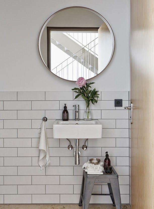
It's hard to find inspiration for a downstairs toilet, because they are very tricky to photograph! I am wracking my brains of how I am going to show you the final finished room - it might need to be my first home vlog tour! But I love this simple styling from Grey and Scout paired back, classic and a hint of contemporary with a country feel.
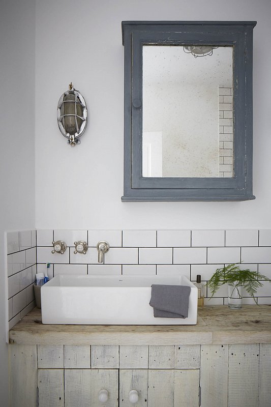
I found this beautiful tiling mixed with a traditional design sink from UK Bathrooms and pinned it to my For Our Forever Home Pinterest board! It seems almost silly putting so much love and thought into a cloakroom but it's one of the rooms in the house that gets used the most, and by everyone! The boys blast in and out, guests use it who visit for the day and we often leave the door to the hallway open, so we wanted to take the chance to do something a little nicer than originally planned. Take advantage of the opportunity of it being a little space to choose fancier tiles (on the basis we wouldn't need as many as the main bathroom) and keep costs down by tiling just a splash back as opposed to half or full tiling the entire room.
It's a very old house and as much as I love modern elements, we knew the suite needed to be in keeping. We went for the this WC from bathstore which was on offer and the Savoy corner sink with a handrail underneath. So we bit the bullet and found a like for like toilet and sink and with next day delivery the full makeover commenced! I realised having the hand towel fixed to the wall meant mucky pups were washing their hands (which was a win in itself) and dripping all the excess water down the wall before the reached the towel! Whilst I love all the fancy pants modern taps and the statement sinks like this heavenly beauty I found photographed by Paul Massey, this is a little room, in a 16th century home and the traditional look is just right.
The taps we bought have the porcelain hot and cold detailing and it all feels so bright I almost don't want to spoil it with using it! The sink is in but as the toilet was being fitted we hit a problem! It resulted in the original (but looking very tired and worn) parquet flooring being ripped up, the soil pipe being moved.
I saw this as a marvellous opportunity to persuade my husband to choose the Fired Earth tiles I have been dreaming of! I've actually taken their brochure to bed a few night this week (yes very romantic!) and we've oohed and aahed over the bold prints and patterns which you just can't find anywhere else.
We needed to order the tiles asap on a next day delivery not to halt the progress and luckily our favourites from the Patisserie range were available from our local Sherborne store.
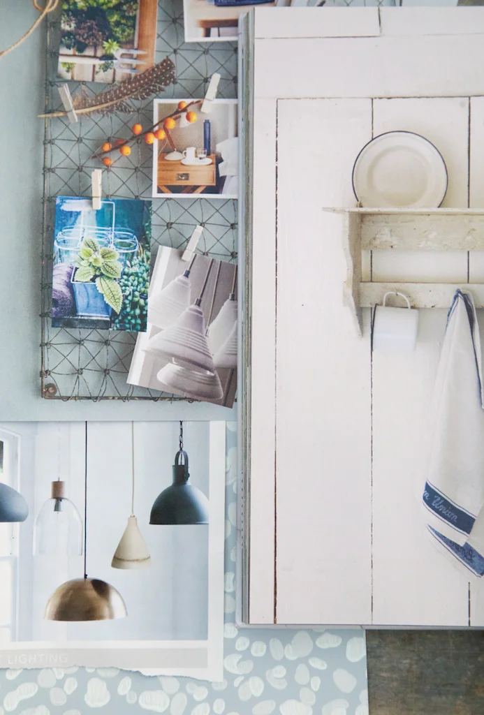
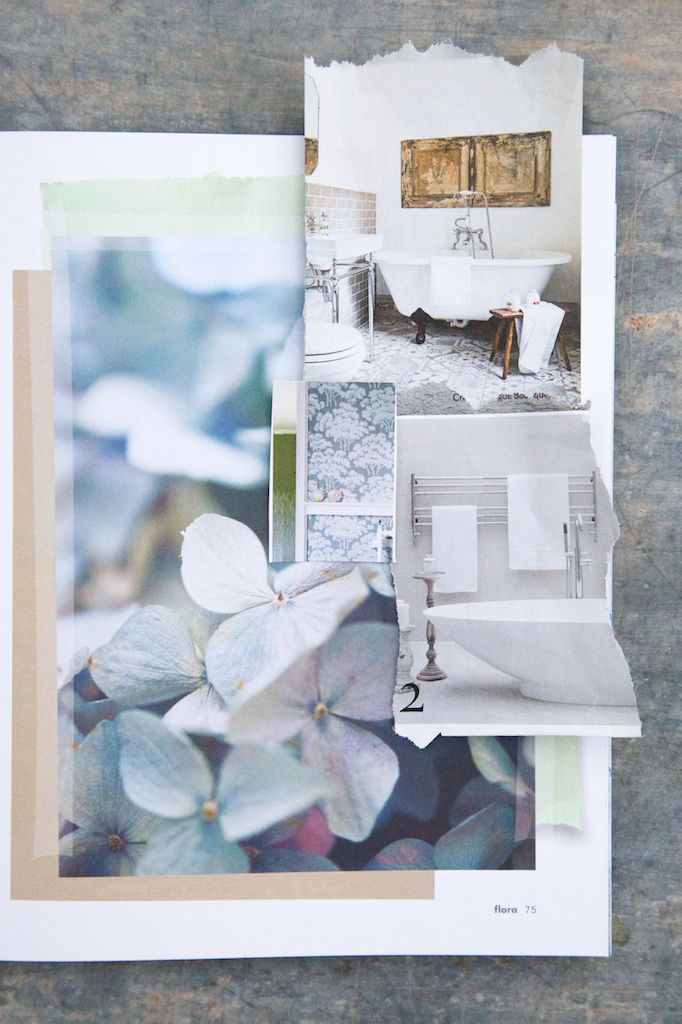
I looked though some of my very favourite interiors books and magazines and by collating all my ideas together it helps to visual the finished room, agree colours and styles with my husband (and less arguments!) and hopefully helps anyone else looking for the same interior styling as us!
I love Inspire by Willow Crossley, Living Life Beautifully is my dream country interior style and I always find things to wish for in Pure Style Home. I tear out product pages from home store catalogues and adore the lighting department in Cox and Cox.
So the challenge is on! The tiles will be delivered on Monday, fitted and I can start sourcing the lovely bits, a blind, accessories for the freshly painted deep window ledge and possibly a lovely new towel. I want to think about some artwork too, rather than replace the wallpaper that lined the entire room beforehand. Something more soothing to balance against the busy print floor!
I'm thinking a set of pencil drawing botanical prints, what do you reckon? Any ideas where I could source them from?!
I can't wait to show you the finished result.
psst. This is not a sponsored post, I have linked to companies we love and products we have bought. Have a good Friday!


