It is only ever a matter of time before the interiors leaders work their magic with runway textile ingenuity and those trends filter down through faster fashion, homeware seasonal launches and into food, like an annual flow chart. Miranda Priestly’s epic monologue in The Devils Wears Prada summed it up with flair.
“What you don’t know is that that sweater is not just blue, it’s not turquoise, it’s not lapis, it’s actually cerulean… Then it filtered down through the department stores and then trickled on down into some tragic casual corner where you, no doubt, fished it out of some clearance bin.”
Let’s get one thing clear this is no backdrop clearance bin! But trickle it does. Catwalk couture becomes high street fast fashion, it just takes a little longer. What we wear then influences how we decorate our homes and eventually where we eat and how we dress our plates, as well as the table. My job is to make sure that not only do I feel that water before it heads to the high street, but that I divert it, and let it meander towards the backdrop industry.
It’s been no secret to my sister that a long standing dream of mine is to launch each new collection hung with hangers on a clothes rail. Strutting down our countryside studio floor, talking you through each design, like they are straight off the sewing machine rather than printer. Because design affects everyone.
Lucy on location in Porto, Portugal 2021
Marrying design and the number one emphasis in an individual consumer’s world is the magic and the challenge. Without doubt health over wealth is the focus this year.
Whether it’s through communicating your brand’s eco responsibility, demonstrating your contribution to sustainability, or truly understanding, and tapping into, your clients emotional responses to your products, we want to feel good.
Good when we make a purchase, good when we produce a piece of work and in turn, get a good reaction.
Since forever companies have used every hue from the rainforest jungle amazon greens to the pastel turtle turquoise of a Maldivian Sea to shout about their eco-credentials. But 2024 sees a shift towards using the other elements of air and water to evoke those feelings.
Calming, trustworthy, stable in a world seeking peace. Think of some of the longest standing and most influential global brands; Disney, Unilever, HP, Dell, Bic, Oreo, PayPal. Social platforms like Facebook, blue ticks, banks and even budget airlines, communicate their reliability, their ability to anchor you through blue.
Prime shipping… speed by name, reliability by colour.
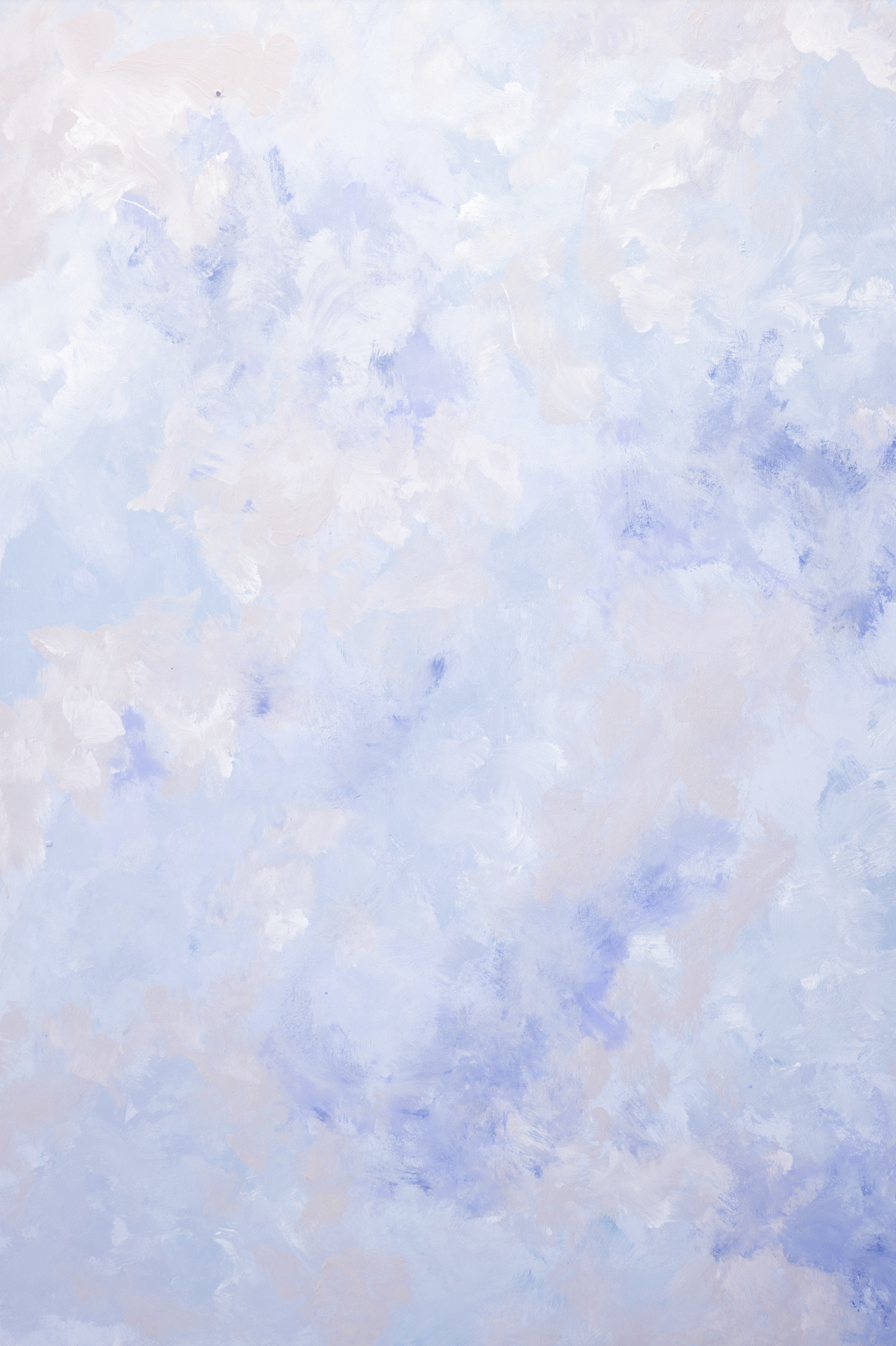
And in a departure from Pantone’s warm predictions, the leading paint companies in the US have headed straight to shades of Patriotic Blue. And… with more than a few choosing to promote a violet undertone (Even Dulux’s Sweet Embrace has a definite mauve to it, which instantly softens their impact. Pantone’s 2022 Periwinkle is making a comeback in the form of Benjamin Moore’s Blue Nova.
Benjamin Moore’s Colour of the Year 2024 - Blue Nova
The heritage paint companies have carried a traditional royal blue, variations of naval navy but food photography posts would have you believe that blue is off the menu when it comes to creating mouth-watering moments on camera.
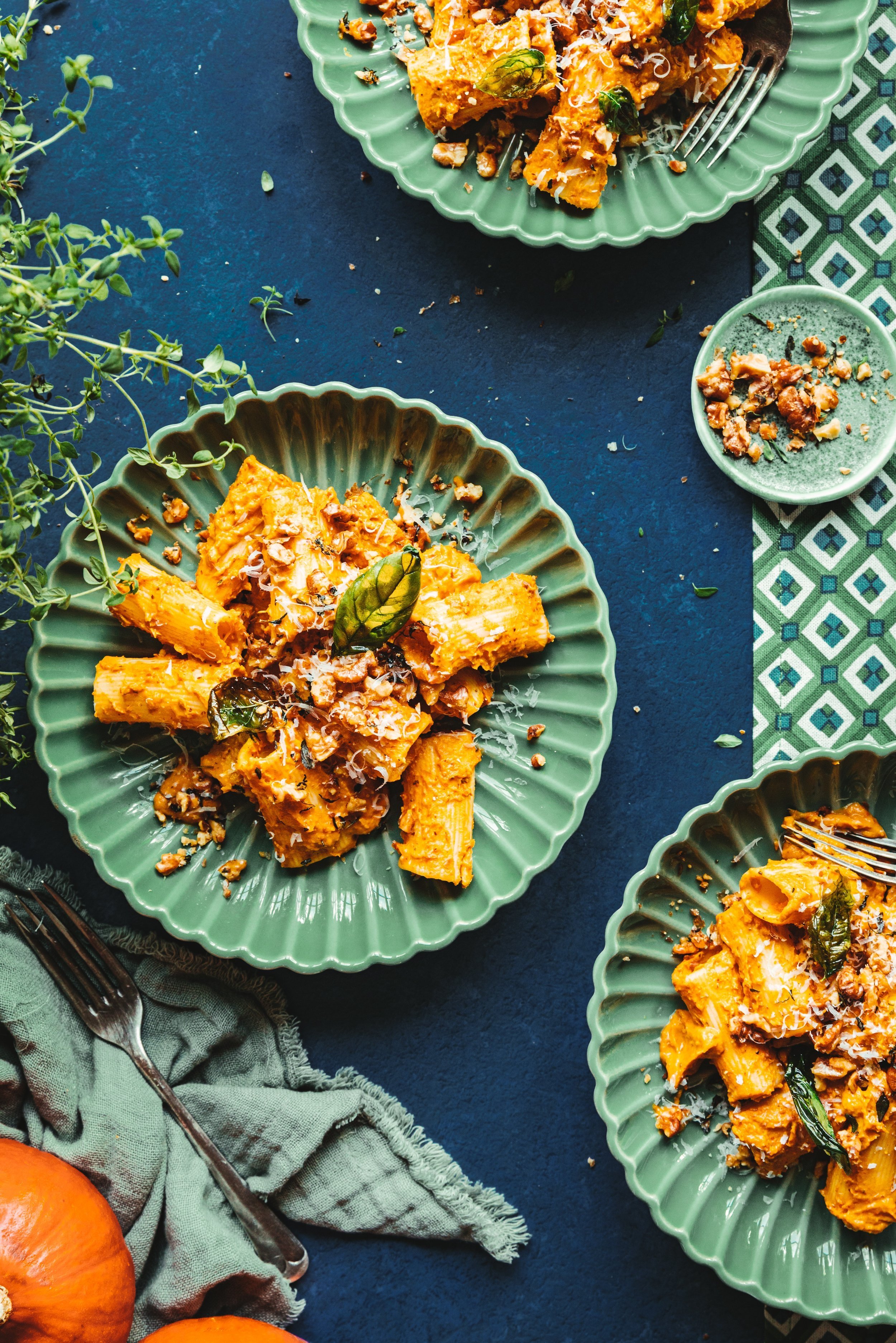
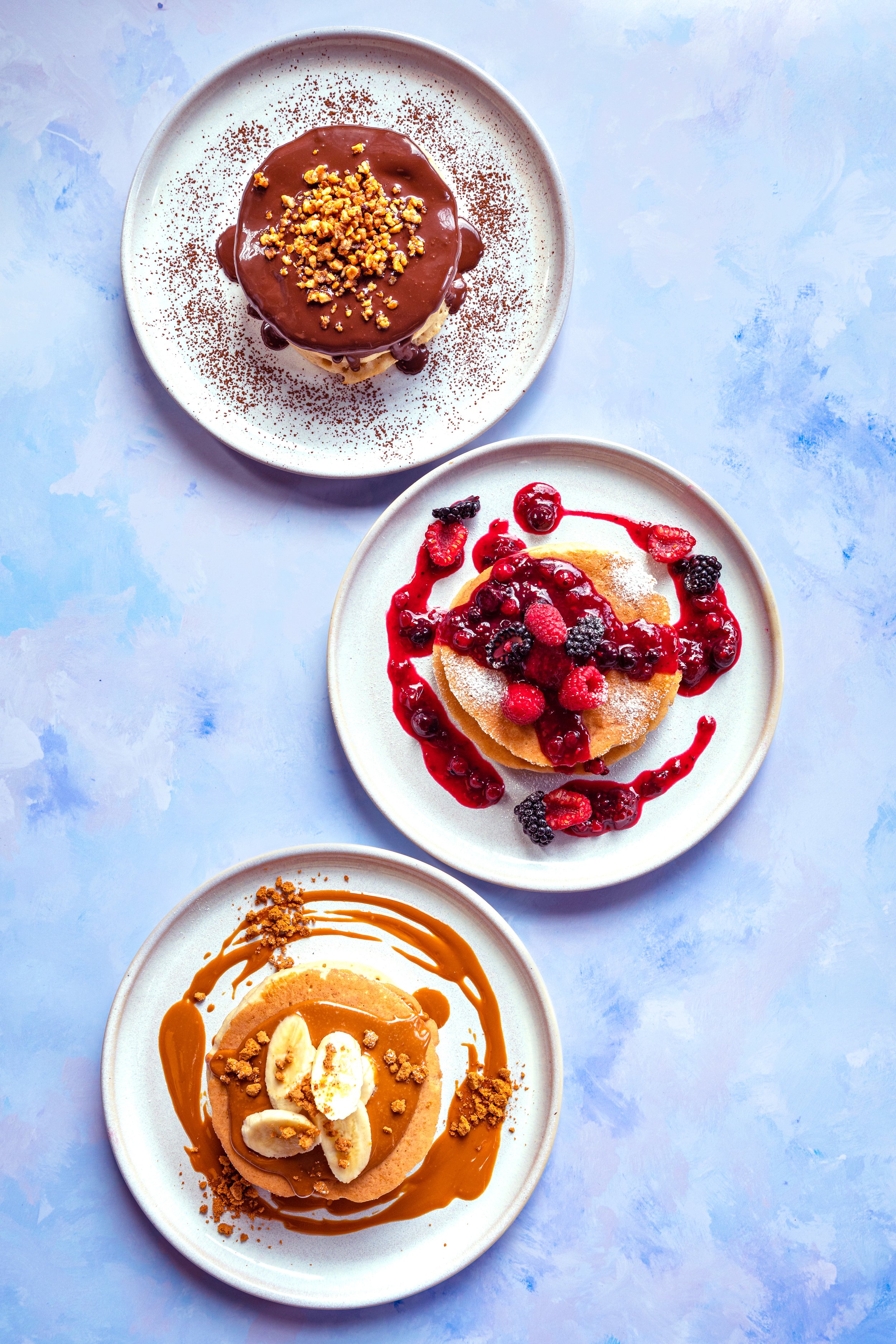
I have read countless blogs over the years, which go completely against colour wheel theory. Convincing us all that blue was a definite no no when it came to restaurant imagery and food packaging. Yet paired against yellow and oranges it pings like a popper at a surprise party! Think breads, pastries, curries, potato dishes. Citrus fruits all have that added zing when shot against a background of sea-like swathes of paint.
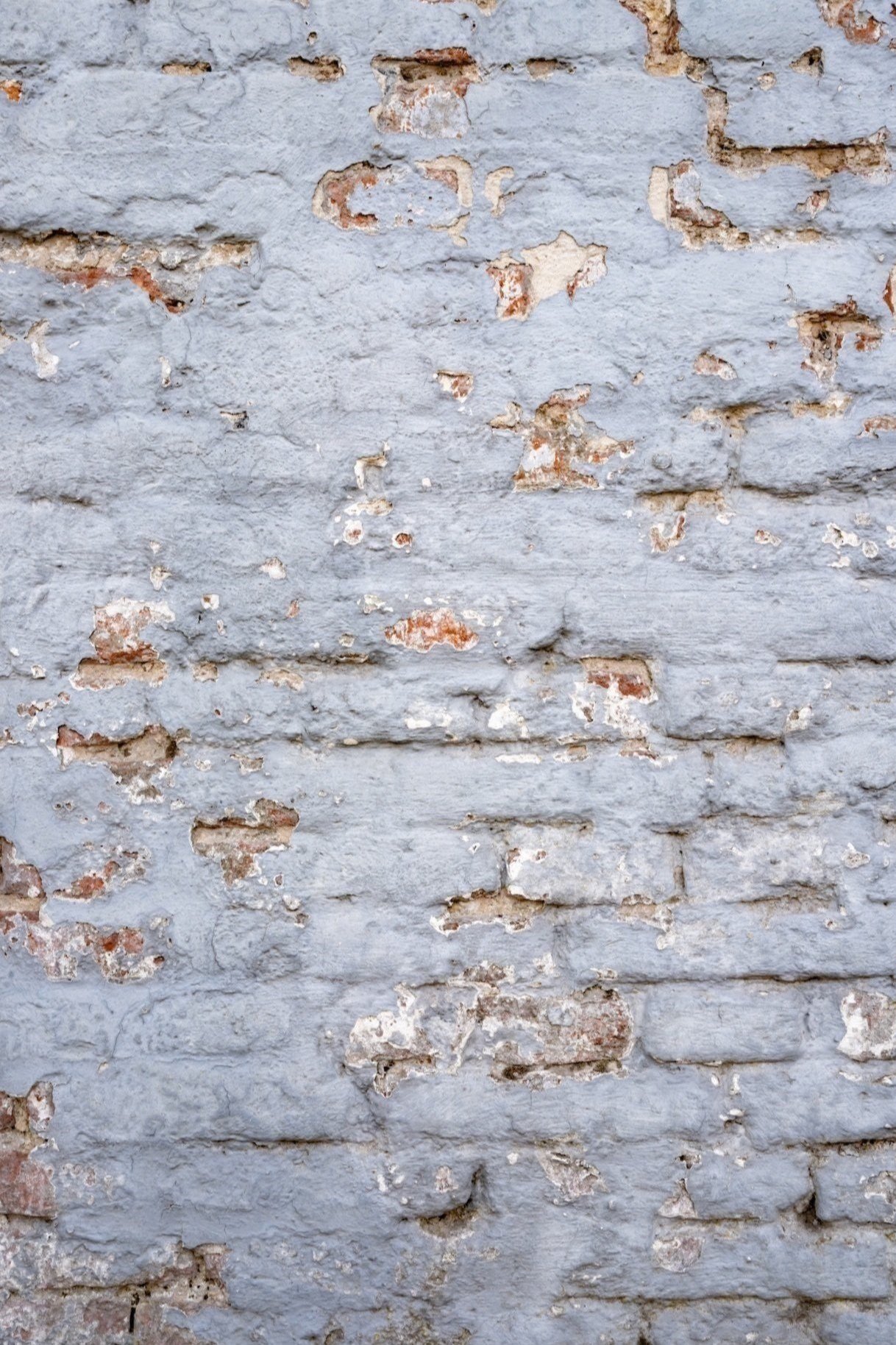
I see it differently. One of our first blue designs in 2017 was the Glacier, a tatty wall around the back of the local electricians in our closest market town. But this week I am anxiously watching the DHL tracking information to watch a set of XL backdrops, including that Glacier, head to Buzzfeed in LA for an exciting edible campaign shoot. Yikes.
And it doesn't stop at paint. KitchenAid revealed their Colour of the Year today! Blue Salt we love you.
Seeing a shift (and in contrast to the warm forecasting by Pantone) towards the cooler blues, they share the vision of these interior powerhouses.
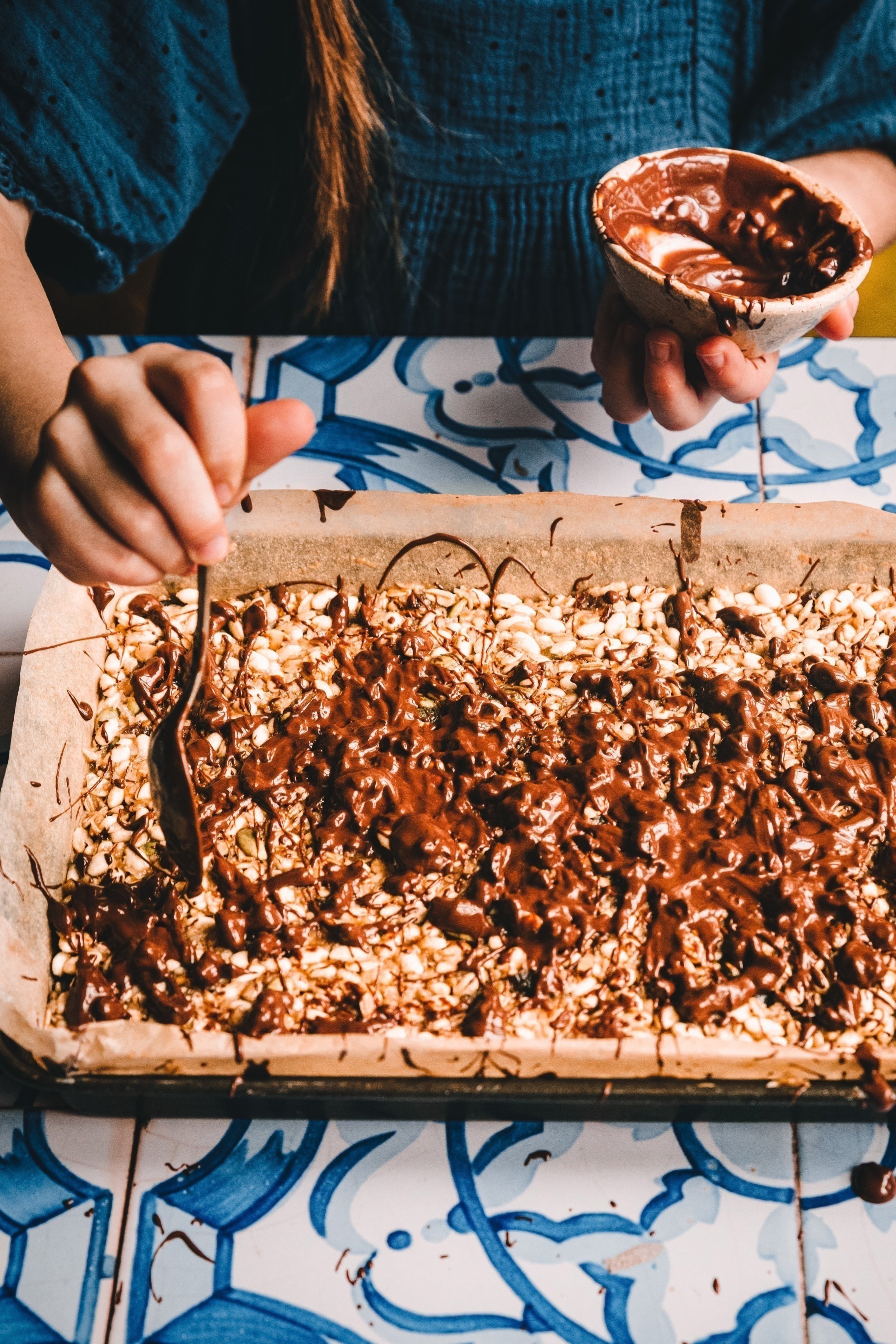
And so do we. Since launching the Candy Periwinkle with Wish Upon a Cupcake in April 2021, blue has featured heavily in our collections from Portugal to Belgium to the hand painted boards I shot in 2022.
Elsa is making her frozen mark in 2024 with more muted glacial tones for those among us wanting to dip our toes in the water, pun intended. And bolder print tiles if you are ready to dive in head first from a great height.
Introducing a sense of wellness, a sense of gravitas to your brand or brief is both sensible and actually contemporary. It’s not cold or conservative. You won’t need to squint to detect a whisper of magenta with these designs, which will help you manifest a more feminine, but not girly, approachability to your imagery.
There is no reason to be tentative, it’s the most reassuring colour in your palette. And you can introduce it in so many ways regardless of whether your brand colours or visual aesthetic feature the opposite. Let me help you find the blue for you.


