
Tips for Better Blog Design • BritMums Live 2014
It was an incredible honour it was to be invited to speak at BritMums Live this year by Jen and Susanna, and when they initially told me they wanted me to speak about how to make your blogs more beautiful, I felt a slight panic.
It's a daunting task standing up in front of a room full of talented bloggers and offering advice for better blog design, especially when I can assure you all, there are lots of changes I would love to make on my site.
But after researching the subject heavily over a period of weeks leading up to the conference, I realised there are lots of basic principles of good design that we could all benefit from being reminded of.
It's easy to get into a habit with your blog design. Hands up if you are in love with blogging? Yep me too! But the trouble with loving our blogs is that we all think our blogs look great! And sometimes a pair of fresh eyes can be the best thing.
The tricky thing I think as a parent blogger is, if you start your blog when you are pregnant or have little ones, to mature your blog design as your children mature.
You can download the whole presentation below. But I am going to share my notes too. Warning! This is a mammoth post - but I didn't want you to miss out on anything if you weren't in the session.
The first thing I want you do do is GET OFF THE COMPUTER! It's too easy to start fiddling behind the scenes and what you need before you look at a design makeover or even small tweaks is ask yourself these 10 questions.
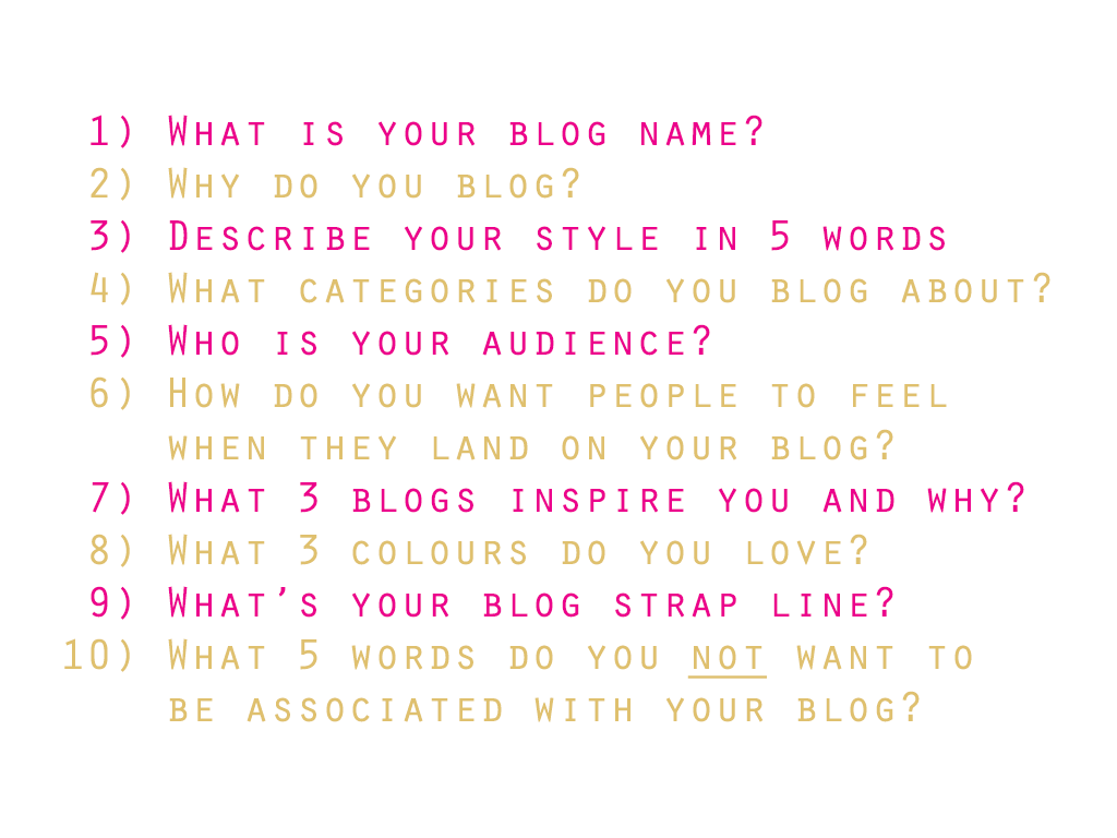
The most important question is number 3. Your blog should represent you and your style. Choosing a theme because it looks pretty or like a blogger you love is not a good place to start! The more I stay true to my style the easier I find it is to blog.
As soon as you start projecting a manufactured style it feels like hard work. Hard to maintain a particular style and imagery. Stay true to you. Write those 5 words on a piece of paper and stick them on your noticeboard. Then translate those through everything you do. I am bright, bold, cheerful, loud and happy by nature. So I want my blog, my tweets, my photos on Instagram to represent those 5 words.
CONTENT INFORMS DESIGN - my blog is seriously photo heavy so I wanted a design that highlights the photography. Think about what you blog about and tailor your design to it. Good design is about showing off your best bits!
And I came to understand the difference between whether you blog for yourself or for your readers, both in terms of content and design.
So ask yourself - is your blog easy to navigate? Do you have a search facility clearly visible in a prominent place in your sidebar and a photo and short bio at the top of your sidebar letting people know who is behind the blog?
Do you write up your weekend and post a nice set of pictures, like a journal or do you blog an idea for your readers to help keep their children entertained over the weekend? I want to blog for my readers, to give you original content with information you can take away with you and find helpful and inspiring.
Why do you need good design? It’s not about just making your site look nice, the most important thing is making your blog easy to read. Think about how people read blogs - so many read on their phones so make sure your site is responsive!!!
Your design is your constant. It’s what evokes your style and your blog’s identity. Your content is your inconsistency, but that’s what keeps people coming back again and again! Your design is what people associate you with so you can write about any subject in the world, but readers will recognise your style.
Now it's time to consider your LAYOUT
Elements that make up a traditional blog are
- Header
- Navigation
- Content
- Sidebar
- Footer
The HEADER is the first thing people see. Is it clean and fresh? Is it easy to read?! Is your header in keeping with the medium you use elsewhere? So if you use an illustrative header, use illustrations for your social media icons. Think consistency! No one will be impressed with a blurry image!
And if you've designed a fantastic header pimp it out. Make use out of it and use it everywhere and anywhere!
Your NAVIGATION is a pick and mix stand full of delightful discoveries but if you chose one of every sweet available you'd be sick! So limit your menu options to highlight the content you want your readers to see. Your menu is where you can hide away all your wonderful content. You can entice new readers with an about me page, you can highlight to companies and pr agencies looking to work with you where they can directed to all your contact details, links to your media kit etc.

Manage what you want people to read. So I want to highlight my photography work - in the hope someone will want to hire me and that’s why I slimmed down my menu. You can share the blogs you love you can highlight individual categories by using drop downs instead of overloading your menu tabs.
Make sure your contact info is on each page, that's one of the big bug bears I hear from pr agencies, that they can't find the contact information quickly and easily.
The BODY of your blog is your content and is your unique selling point. Think of your content as the Best Actor Oscar winner with everything else sitting in a supporting category. There are some simple things you can do to make an INSTANT difference.
- Consider alignment & readability - The most important thing is to make your blog as readable as possible. This means aligning your text paragraphs and photos to the same width to span the body container. Big white space around your photos on distract from them and make your site look untidy.
- If you look at professional publications the text is ALWAYS left aligned. That's because we read from left to right so don't make it hard for people to follow your writing with centre aligned paragraphs.
- Do you break your text into bite size paragraphs? People read on the go so try not to overwhelm them with an essay, as the message of the post may get lost. Ironic I know given this lengthy post!
- Think about what you want people to read first? Your sidebar or your content? And align them accordingly.
Your SIDEBAR is a wonderful distraction and first think about where you want it. Right of left aligned depending on what you want your reader to see first.
What most people want to see first is you! So make sure your sidebar leads with you. Add a short bio and upload a nice, friendly picture of you!
Manage the content within your sidebar and add a prominent search button! How often have you searched on Pinterest found something you love, but it links to the home page rather than the blog post? How annoying! Have a search button where people can see it!
If you have a beautiful blog don’t let your sidebar of shame let you down. Cluttered, images of different sizes, flashing adverts and videos that play automatically do not shout great design.
ADVERTS & SPONSORS - Try and make the ads as in keeping with your style as possible. Talk to your sponsors, offer to create an ad for them. If you move in similar blog circles to your readers you don’t all want the same ads on your blog!
Don’t duplicate your menu. Use your sidebar as an opportunity to display collections. Showcase your favourite posts a new reader widget that takes you to the posts you think best sum up your blog and perhaps your most popular or seasonal posts at the moment. So over Easter I updated my sidebar with links to craft posts from last year as I ran out of time this year to post new content!
Create a separate page for linkys you join in with. You want as much control over YOUR design on your homepage as possible.
Now I am a more is more girl, that’s my style but when it comes to design I am inclined to agree with Coco Chanel. When it comes to side bars, less is more.
“Before you leave your house, remove the last thing you put on, as it is generally unnecessary.”
A FOOTER is not a dumping ground it is an opportunity. You may want to use your footer as your sidebar or have your contact details for in the footer on each page.
Remember if you post excerpts with a read more, or view the full post options, then your footer will become far more prominent.
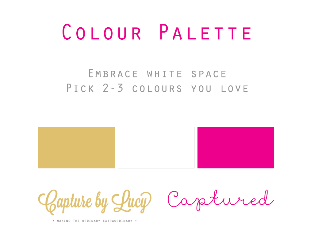
I love colour but I have realised the importance of a consistent COLOUR PALETTE on your blog.
I am sneaking in a little pink here and there but I stick to a clean colour palette of gold and white. I found it difficult to let go of my busy background but the best thing you can do is embrace blank space! My natural instinct is fill the space on my blog with colour but all that does is distract from my content because my photos are full of energy and colour. If your content is more text heavy then stick to a white or neutral textured background. You can see how busy using a pattern makes my site - not good at all!

Think about 2 or 3 colours you love and stick to them. Use sites like colourlovers.com or design-seeds.com for great colour combinations.
When choosing text colours go for darker colours on a lighter background. Neon shades are really hard to read which is why I moved away from my turquoise and black or navy site backgrounds are almost impossible to read text on!
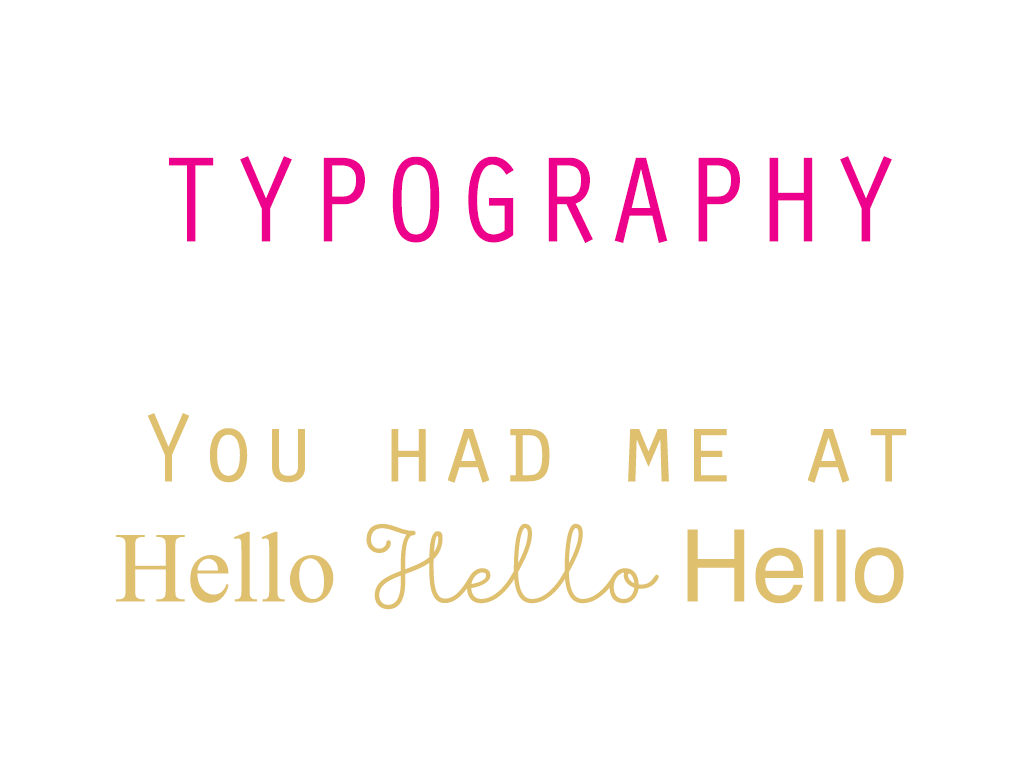
When it comes to blog TYPOGRAPHY there are 3 typical fonts you want to use. A serif, sans serif and a script. A serif is a traditional looking font with feet and flips, a sans serif is without and a script font. But script fonts are much harder to read so try to use one serif font, one sans serif and keep your twirly script fonts for annotations rather than menu tabs, headers and text.
As with colours look to use 3 fonts. Everything you post should be representative of you and your style. A mismatch of fonts and styles just looks confusing not consistent!
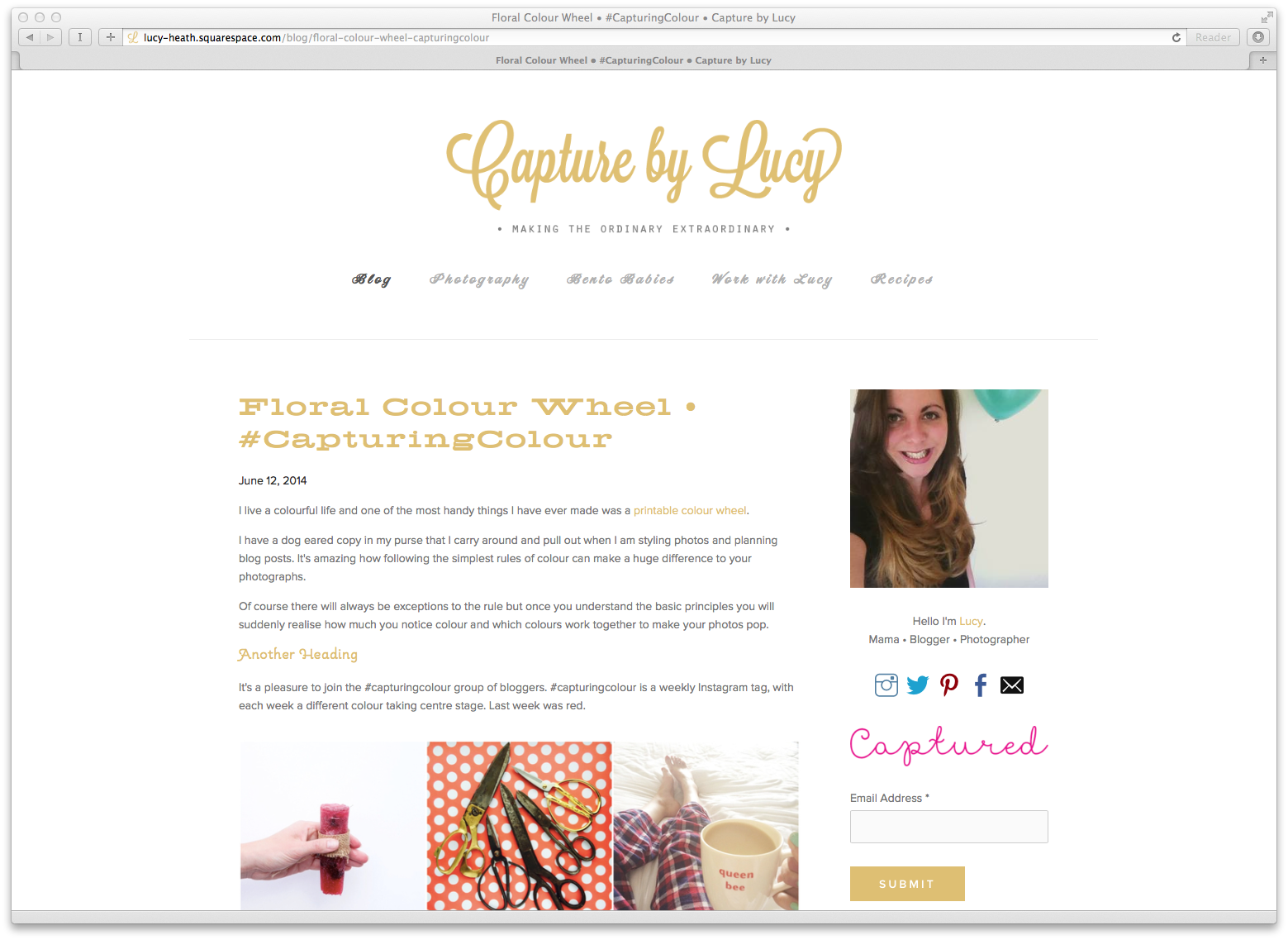
I love encouraging others to fall in love with PHOTOGRAPHY and it's the greatest pleasure to see bloggers capturing beautiful photos for their blogs. But I have 2 requests. Please showcase your best, at the best size!
Span the container - as in the area you post in. Mine has a wide post area so I size all my photos to 1024 pixels wide. But the text and images all align with each other. If your photos are from your camera and may either be small in size of a little grainy, then post them in a collage.
One of my design to dos on my blog because I post lots of photos is to get rid of the forever scroll and use post excerpts. If someone checked in on my blog once a week they may never see what I posted at the beginning of the week!
One of the biggest problems for me is how quickly my site loads, because my site is flooded with images. So I upload my photos to 72dpi (They are less likely to be stolen too as they won't print particularly well.) and have started arranging several portrait photos together to condense the length of the post.
If you post high quality images you MUST help your Pinterest loving readers out and install Pin it buttons! You can customise your own or use the standard ones - head to the goodies page on Pinterest.com, but I find rollovers really distracting and annoying - you know when you hover over the image and it fades it away with a mask. Let your images breathe and remove that feature!
I cannot stress the importance of DESIGNING TO ENGAGE
Are you familiar with the fold? The point at which you have to scroll down for the first time. Above the fold is everything you can see on screen before you start to scroll. Of course this is different for everyone try and get a peek at your blog on different devices and whilst you are there try it out on different browsers.
I always check how my posts read on my phone, to see how the images display on a smaller screen and I spot mistakes far quicker!
Commenting
- Make it easy! One of my areas to improve is changing the default comment plug in. People don’t like having to sign in to a social media account in order to comment. Readers also don't like Captcha. Take it off and install a good spam filter like Akismet.
- Calls to action - spark a discussion amongst your readers. A genuine question in your posts that provokes debate. Not what breed of dog could you be if it was Friday and national dog day but relevant questions to the post content.
Make subscribing easy - however you want people to follow your blog promote that!
Involve your readers
- Ask your readers for some feedback? Take a few screen shots in preview mode and share them. Before you make changes! It’s too easy to share “Hey here’s my new header, what do you think” and be bombarded with kind and thoughtful replies but no critique.
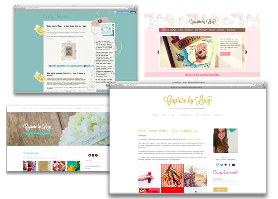
DON'T WAIT TO CHANGE OR UPDATE YOUR DESIGN - JUST DO IT! Look at my site, it's taken me two and a half years, and 4 updates to get to a point where I am 100% happy my design reflects my style.
Don’t give in to the the things that stop us changing our design - we can be scared to do it, fear we will lose followers and readers and we all suffer from comparing ourselves to something else. Having confidence is the best quality you can have as a blogger!
And what we all need is confidence and a confidante! I’ve found a blog buddy who I’ve built up a friendship with over the last couple of years, I send her ideas, bounce things off her, run new design ideas past her and I trust and value her opinion.
We must also remember we cannot be everything to all people - you will find your tribe and they will find you. Don't try and blog content to chase traffic. Integrity and honesty always win in the long run.
Try to be inspired but don’t copy. Copy cats have no creativity.
And if in doubt ask - we bloggers are great at diy learning and you'll find the blogging community no matter what genre are friendly souls.
Now you've made your blog gorgeous TRANSLATE YOUR DESIGN AND EXTEND YOUR STYLE EVERYWHERE.
You have a beautiful blog, use that beautiful design and put your signature stamp all over your work. So that means extending how you present yourself on your blog through your email signature, your blog cards, your cover photos and so on.
Make sure your twitter cover photo is in focus since the update and don’t forget to do simple things like check your links! Don't let simple things let your creative and unique design let you down.
Your blog is the second version of you so write the internet you want to read!

I couldn't talk about BritMums Live without saying an enormous thank you to everyone who nominated and voted in the Brilliance in Blogging Awards 2014. I was ecstatic to win the Photography award, amongst such incredibly talented bloggers in the finals and overwhelmed with all the love and support from both the bloggers who attended the conference and my session and those who send tweets and messages from home. I am grateful for every single one and am still replying to them! It was a pleasure to talk to Julia Boggio after the awards, who judged the category and she gave me some valuable feedback, advice and recognition. That was the icing on the cake.
I don't believe people who say blog awards mean nothing because to me it meant everything. To be recognised by your peers, to have the opportunity to walk on that stage, with your heart beating out of your chest is the most incredible feeling.
Thank you, thank you, thank you.
And a special thanks to Bubblegum Balloons who supplied the most amazing confetti filled balloons to dress the room, Gift Cookie for the awesome personalised blog pencils (I do hope you all took one!) and an extra special thanks to my sister, who carried a double duvet full of balloons up a service lift, ran around like a madwoman in the 5 minute change over period and who supports me and my blog every single day. I was so thrilled she got to see the wonderful world I am part of for herself.


